The specification for CSS transforms had been in the works since 2009. There were separate specifications for CSS 2D transformations, CSS 3D transformations and SVG transformations but they have all since converged into a single specification called the CSS Transforms Module Level 1. Browser support for 2D transforms is very good, with all major browsers fully supporting it at least two versions back (sorry, but IE8 is really old now). Browser support for 3D transforms is also reasonably robust. All major browsers, aside from Internet Explorer, fully support it at least two versions back. Internet Explorer 10 onwards supports everything except transform-style: preserve-3d. So no nesting of 3D transformed elements, but other than that, all is good.
There’s quite a lot to CSS transforms so there’ll be multiple parts to this article. This part will cover the basics of why we should use CSS transforms as well as how 2D transforms work.
It’s all about performance
Performance has always been an aspect of web development (and design) that is very important to me. You know those developers who test sites on PageSpeed Insights, Pingdom, GTMetrix AND WebPageTest? I’m one of those people (or maybe I’m the only weirdo who does that, please don’t judge). But recently, I’ve become very interested in animation on the web, largely from the most recent The Web Ahead episode with Rachel Nabors. It’s a fascinating episode, especially the part which discusses the science behind how the human brain processes the animations we see.
The issue of jank was also discussed. If you’ve ever heard the term 60 frames per second (fps) being thrown around conversations between front-end developers, this is what we’re talking about. Most devices today have a screen refresh rate of 60 frames per second. To have smooth motion on the screen, the browser should match that refresh rate. Jank is just a term we coined up to describe any stuttering during the animation, mostly because the animation can’t keep up with the refresh rate of the screen.
How browsers render stuff
What does this have to do with CSS transforms? Oh, everything. First, we need to have some understanding of how browser rendering works. The definitive primer on how browsers work by Tali Garsiel is required reading for all web developers, in my humble opinion.
Every browser has a rendering engine, which displays content onto the screen. Each of the major browsers use a different rendering engine. Firefox uses Gecko, Internet Explorer uses Trident, Safari uses WebKit and Chrome and Opera (from version 15 onwards) uses Blink, which is a fork of WebKit. In a very condensed nutshell, this is what happens:
- Browser parses HTML elements into the DOM tree
- Browser parses style data to construct render tree
- Browser lays out the render tree by generating the geometry and position for each element
- Browser paints the render tree by filling out pixels for each element into layers
- Browser composites the layers, i.e. puts them together and draws them out to the screen
Not all the things should be animated
Because this is a waterfall process, making changes to processes near the beginning make the browser work harder than those that come later. Different CSS properties trigger the browser differently. But those that affect layout are the most “expensive” and those that affect compositing are relatively much “cheaper”. Paul Irish created CSS Triggers, which is a site that documents the behaviour of all the CSS properties. There are only two properties that trigger compositing alone when changed, opacity and transform, which is why the most performant animations are done using these two properties.
The good thing is that almost all animations on the web can be accomplished with these two properties alone. The meat of the animations would be covered with the transform property so it’s good to know exactly how it works and what it can do.
Basic terminology for CSS transforms
One thing to note is that transforms don’t work on inline elements. The specification explains transformable elements as block and inline-block elements, as well as elements whose display property resolve to table-row, table-row-group, table-header-group, table-footer-group, table-cell or table caption. SVG elements can also be transformed. Transforms are also cumulative, meaning the element will aggregate all the transform properties of its ancestors and itself to define a current transformation matrix. The transformation matrix is computed from the transform and transform-origin properties.
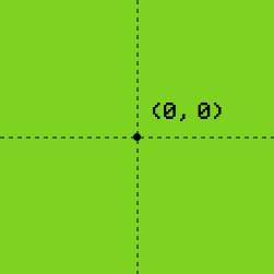
Coordinate systems are how the browser knows where everything is supposed to be laid out. Every document viewport has its own coordinate system. The x-axis goes from left to right, while the y-axis goes from top to bottom. The top left corner is represented by (0, 0). There is also a z-axis, which goes into the screen from the perspective of the user. An element with a transform property establishes its own local coordinate system, with an origin point right on the centre of the element, (50%, 50%).

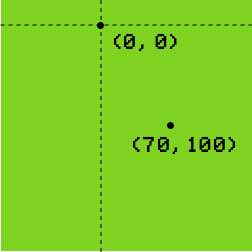
You can change this origin point using the `transform-origin` property as follows:
.some-element {
  transform-origin: (100px 25px);
}
Note: I use Autoprefixer when I compile my Sass files so my syntax will be prefix-free in all the examples.

Any coordinates specified will be computed based on the transform origin at (100px 25px), as seen from the second point in the diagram.
2D transform functions
There are 4 types of 2D transform functions, translate(), scale(), rotate() and skew(). Every transform has an equivalent matrix() function, which specifies a 2D transformation in the form of a transformation matrix of six values. Calculations for 2D transforms are made on a 3x3 matrix. For a full explanation of the math behind CSS transforms, check out Understanding the CSS Transforms Matrix by Tiffany Brown. In a nutshell, the matrix() function is shorthand for you want to apply multiple transforms on a single element.
transform: rotate()
rotate() allows you to rotate an element around its transform-origin by the angle specified in degrees. Positive values rotate the element in a clockwise direction and negative values rotate the element in an anti-clockwise direction. You can play around with the sliders below and see what happens if you change the transform-origin.
See the Pen CSS transforms - rotate property by Chen Hui Jing (@huijing) on CodePen.
transform: scale()
scale() allows you to grow or shrink an element from its transform-origin. It take in two parameters, [sx, sy], where sx scales the element along the x-axis and sy scales the element along the y-axis. If no value is supplied for sy, it will take a value equal to sx.
Any values greater than one will grow the element while values between zero and one will shrink it. Positive values transform from left to right and top to bottom, while negative values transform from right to left and bottom to top. This is easier to understand by adjusting the sliders below. You can also specify scaleX() or scaleY() which grow or shrink the element along the x-axis and y-axis respectively. For scaleX(), only the x-coordinate of the transform origin is relevant, and for scaleY(), only the y-coordinate is relevant.
See the Pen CSS transforms - scale property by Chen Hui Jing (@huijing) on CodePen.
transform: translate()
translate() allows you to move the element in any direction based on the x and y coordinates specified. It takes in two parameters, [tx, ty], where tx translates the element along the x-axis and ty translates the element along the y-axis. ty is an optional value, and if not supplied, will take the value of zero. For translateX(), the translation only takes place on the x-axis and for translateY(), the translation only takes place on the y-axis.
See the Pen CSS transforms - translate property by Chen Hui Jing (@huijing) on CodePen.
transform: skew()
skew() applies a 2D skew by the angle specified along the transform-origin point. It takes two parameters, [ax, ay], where ax skews the element along the x-axis and ay skews the element along the y-axis. The second parameter is optional, and if not specified, will default to zero. For skewX(), the skew will take place along the x-axis, and only the y-coordinate of the transform-origin is relevant. For skewY(), the skew will take place along the y-axis, and only the x-coordinate of the transform-origin is relevant.
See the Pen CSS transforms - skew property by Chen Hui Jing (@huijing) on CodePen.
Part 1 Wrap-up
That was a lot of the basics and simple 2D transforms. Hopefully this has convinced you that CSS transforms is something you should to your CSS toolkit. Of course, a lot of the exciting and fun stuff will be about 3D transforms and animation, which will be covered in the next part. Stay tuned, people 😁.