So this month, I met a lot of awesome people while attending my very first Mozilla All-Hands, among whom were Lin Clark and Jen Simmons. I’m an unabashed fangirl of both these women, but I kept my composure throughout the experience, because…attempted adulting.
Anyway, if you’ve read some of my blog posts or tweets (probably re-tweets), you’ll realise that Jen is a huge source of inspiration for me. Maybe I should do some data analysis on how often I mention her, that’d be interesting…(okay, I’ll stop being distracted now)
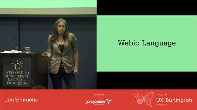
But the latest talk of hers that I watched was the one she gave at UX Burlington earlier this year on “Designing with Grid”. You can (and I personally think, should) watch the full talk on Youtube and go through the slides at your own pace.
About that CSS grid…
It’s been around 8 months since CSS grid has shipped, and as people start to pick it up and use it in their projects, we’re starting to see more articles and talks about CSS grid. That’s a good sign, because we do want CSS grid to become the industry standard for creating layouts on the web.
My key resources for keeping up with CSS grid developments haven’t changed though, and you probably have the same resources on your list (or maybe not):
- Javier Fernández and Manuel Rego from Igalia, which is the team responsible for implementing CSS grid in WebKit and Blink (I’m pretty sure more members of the team are involved but these 2 gentlemen are more actively writing about their work on CSS grid)
- Rachel Andrew, who played a significant role in advocating for CSS grid to be implemented when almost no one else had even heard of it
- Elika J. Etemad, who is the editor of many, many, many CSS specifications, among which CSS grid is one of them
- Jen Simmons, because she is constantly finding ways to push the envelope when it comes to designing for the web and always coming up with new ideas on how to teach these new technologies and change our industry for the better
A language OF the web
And if you didn’t know before, you’d have found out when you watched the UX Burlington talk, that Jen has a background in film and theatre production. Actually, she has a vast cross-disciplinary design experience that relatively few people can rival. That’s what makes her perspective especially interesting.
When she started talking about telling a story through the lens of a 16mm camera, it occurred to me that perhaps the closest medium to the web was not only print, but film as well. The concept of framing is so relevant to the viewport. Another key idea she proposed was for us to develop a webic language, just like the film industry has a filmic language.
There’s a filmic language, and you go to film school then you start to learn it. There’s, I think, a webic language. There’s some sort of language of the web. Of what these things mean or what these choices mean. And I think it’s going to be interesting to start slowly, together over, you know, decades, figuring out what that is and being able to articulate it and use it with a bit more skill.
—Jen Simmons

The reason I find Jen so compelling, is that she isn’t prescriptive when she shares her ideas. She does not go around telling people that this one way is the best way to do something. Instead, she encourages her audience to think further, to figure things out together, to build on top of each other’s creativity.
What is front-end?
If job descriptions are anything to go by, the term “front-end” seems to be this all-encompassing role that only the most magical of unicorns can hope to fulfil. In reality, I personally know a good number of people who work on the web with skills in areas that most recruiters don’t know how to categorise.
This is highly unfortunate, and makes me question our need to categorise everything into neat boxes. Guess what, life isn’t neat. Sure, there are those who check off every box on the list of “must-have traits/skills to be a INSERT TITLE HERE”, but there are plenty more who don’t.
Seems odd that people accept someone being good at CSS + design, but are mystified by the idea of someone good at CSS + ops.
— Rachel Andrew (@rachelandrew) 15 September 2017
The field of front-end has yet to be defined, because our industry moves too quickly and the range of skills required seems to grow with every passing day. We need to realise that it is impossible to be an expert in every one of those skills, and that’s perfectly fine. I used to think I was an odd bird because I loved the sysadmin side of things as well as doing CSS. Glad to know I’m not alone.

The front-end skill set is not discrete, where you only do one thing. Neither is it a spectrum, where you do several things that are adjacent to each other. It’s more like a Jackson Pollock painting (during his drip period), sprawling and all over the place.
Stronger together (cliché but true)
The term “webic language” stuck with me. I’ve always seen the web as a unique medium and for the web to have its own language makes perfect sense to me. But I want to take it further, maybe co-opt it a little bit. I want to build a webic community in Singapore. Together with all of you.
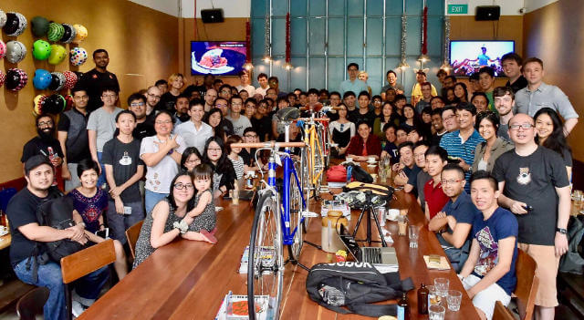
I’m the co-organiser of Talk.CSS, Singapore’s only CSS-centric meetup, which has miraculously been continually running without a hiatus for 2 years. Join me for a drink and I’ll tell you all about why I think this is miraculous 🤣.
If you read the thread of Rachel’s tweet above, you can see that CSS is something that elicits a very wide range of responses. It is amazing, creative, dark magic, a beast to design, and that’s just from this thread. I’ve heard people say CSS is hard, CSS is easy, CSS is rubbish and doesn’t make sense, CSS is intuitive and makes perfect sense. 🤷 #polarising
Proficiency in CSS requires a mental model that is very different from what most popular programming languages utilise. And this quote by Danielle Huntrods sums it up perfectly.
“CSS isn’t a programming language. It’s a stylesheet language. We shouldn’t expect it to behave like a programming language. It has its own unique landscape and structures, ones that people with programming language mental maps might not expect.”
—Danielle Huntrods
Because CSS has matured immensely over the past 20 years, I found that a lot of the functionality that could only be written in Javascript can now be done with CSS. And a lot of the functionality that software traditionally used for digital graphics, like Photoshop or Illustrator can now be done with CSS and SVG.
I stand by my opinion that as long as you’re designing something that lives on the web and is consumed via a browser, it is mandatory that you understand how a browser works, and how the web works.
Do you need to know exactly what lines of code to write to achieve certain effects? No. But you do need to know exactly what can and cannot be done. And you also need to fully understand the implications of your design choices on the people who consume it.
This is why Talk.CSS want to have more people who identify as designers in our audience. Especially designers who are used to designing for the web using tools like Sketch or Photoshop. We want to add another tool to your design toolbox: CSS. Our goal is for everyone who designs for the web to understand how it works.
Talk.CSS in the new year

We didn’t plan for it to turn out this way, but it just so happened that the first Talk.CSS of 2018 will be our biggest event to date. It’s part of DevFest.Asia 2018, which is the week of tech meetups that lead up to JSConf.Asia 2018 and we’ve managed to snag Mandy Michael and Andy Clarke, in addition of our own Zell Liew and Sebastiaan Deckers for a full 3-hour design and CSS extravaganza.
It’s going to be pretty awesome, so if you happen to be around during DevFest week, which is between 22–29 January, come join us! You can get tickets right now, and we’ll throw in a t-shirt plus coffee (the good kind). I really hope to see you there 🙆.
For 2018, we’d like to expand our audience, as well as talk topics to encompass more design-related topics to facilitate this conversation on what it means to design for the web. To make performance and accessibility something that comes up at the beginning of the design process, not hastily slapped on at the end.
I’m constantly saying to anyone who will listen, that Singapore has one of the strongest tech communities in the world, and I truly believe this. There are many factors that contribute to this and I will gladly write a full-length post talking about the Singapore tech community, but not this time. Talk.CSS is a part of this vibrant tech community and we want to do our part to help grow it.

The tech industry needs design more than ever and Southeast Asia is brimming with talented designers and developers who can definitely make a difference and offer an alternative perspective. Nobody is going to hand us a seat at the table, but we have to make our voices heard. Maybe it’ll work, maybe it won’t. But shame on me if I didn’t even try.
Let’s do this.
Slowly.
Together.