I must first apologise for the somewhat rhetorical question as the title. About 3 minutes after I wrote it, my brain exclaimed: “This is clickbait! Clearly if you wrote an entire blog post, the answer should be yes, right??”
Which led me to my next thought. When people write such titles, do they end with a negative conclusion, where the answer is no? What are the statistics on article titles like this? I have so many questions!
This is also why I don’t have many friends. Oh well.
Warning, blog post grew ridiculously long. TL:DR of things is, yes you can do it in CSS but there’s a much better way. Involves Javascript, more details here if you want to skip through the CSS stuff.
Why even countdown in CSS?
Okay, I did not think about this topic out of the blue. I have a friend (I hope she thinks I’m her friend). She tweeted her problem:
I have a countdown timer and I need to show the milliseconds from 99 to 0. 9 to 0 has to be in single digit and centered. The font color and background color of the countdown timer is customisable. This timer will be implemented on both mobile and pc web page. Suggestions?
— Chong Jia Wei (@heyjiawei) January 16, 2020
The way my brain works is to wonder if everything can be built with CSS (the correct answer is no, not really, but you can still try because it’s fun). Even though not everything can nor should be built with only CSS, this timer thing seemed narrow enough to be plausible.
I describe this as a brute-force method, because the underlying markup consists of all the digits from 0 to 9. You then have to animate them to mimic a timer. So maybe it is not the most elegant approach. But it can fulfil the requirements from the tweet!
Here's the list of concepts used for this implementation:
- CSS transforms
- CSS animations
- Flexbox
- Demo-only: CSS custom properties
- Demo-only: Selectors
See the Pen Pure CSS countdown from 99 to 0 by Chen Hui Jing (@huijing) on CodePen.
The general approach
If you Google “pure CSS countdown”, my approach of listing all the digits in the markup then doing some form of obscuring the irrelevant digits seems to be the most common solution. This is the markup for the 2 digits making up the timer:
<div class="timer">
  <div class="digit seconds">
    <span>9</span>
    <span>8</span>
    <span>7</span>
    <span>6</span>
    <span>5</span>
    <span>4</span>
    <span>3</span>
    <span>2</span>
    <span>1</span>
    <span>0</span>
  </div><div class="digit milliseconds">
    <span>9</span>
    <span>8</span>
    <span>7</span>
    <span>6</span>
    <span>5</span>
    <span>4</span>
    <span>3</span>
    <span>2</span>
    <span>1</span>
    <span>0</span>
  </div>
</div>
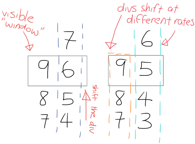
The idea is to animate the digits from 9 to 0 by vertically scrolling the block of digits and only showing the required digits at any point in time.

CSS transforms
The only CSS properties that are “safe” for animation are transform and opacity. If you’re wondering why that is, allow me to point you to my favourite explanation by Paul Lewis and Paul Irish on High Performance Animations.
To animate my digits <div>s upward, I turned to the trusty translateY property. For this use case, my <div> is only moving along the y-axis anyway.
.selector {
  transform: translateY(0);
}
You could do the same with the translate property, but then you’d have to state the value for the x-axis as well because a single value in translate resolves to the x-coordinate.
.selector {
  transform: translate(3em);
}
/* is equivalent to */
.selector {
  transform: translate(3em, 0);
}
Read more about the transform functions in the CSS Transforms Module Level 1 specification. The actual math is in there, and even if that’s not your cup of tea, there are numerous examples in there that can help with understanding how the properties work.
CSS animations
The next step is to animate the transform over time. Cue CSS animations.
The CSS animation properties offer a pretty decent range of functionality to make such an approach feasible. I know them because I researched this when I tried to animate the SingaporeCSS and React Knowledgeable unofficial official mascots last year.
Keyframes are a critical concept when you do animation. Keyframes are what you use to specify values for the properties being animated at specified points during the entire animation. They are specified with the @keyframes at-rule.
@keyframes seconds {
  0%  { transform: translateY(0) }
  10% { transform: translateY(-1em) }
  20% { transform: translateY(-2em) }
  30% { transform: translateY(-3em) }
  40% { transform: translateY(-4em) }
  50% { transform: translateY(-5em) }
  60% { transform: translateY(-6em) }
  70% { transform: translateY(-7em) }
  80% { transform: translateY(-8em) }
  90% {
    transform: translateY(-10em);
    width: 0;
  }
  100% {
    transform: translateY(-10em);
    width: 0;
  }
}

@keyframes milliseconds {
  0% {transform: translateY(0) }
  10% { transform: translateY(-1em) }
  20% { transform: translateY(-2em) }
  30% { transform: translateY(-3em) }
  40% { transform: translateY(-4em) }
  50% { transform: translateY(-5em) }
  60% { transform: translateY(-6em) }
  70% { transform: translateY(-7em) }
  80% { transform: translateY(-8em) }
  90% { transform: translateY(-9em) }
  100% { transform: translateY(-9em) }
}
I’ll explain the values after covering the animation properties needed for the countdown.
In my demo, I’ve gone with the shorthand of animation so the code looks like this:
.seconds {
  animation: seconds 10s 1 step-end forwards;
}

.milliseconds {
  animation: milliseconds 1s 10 step-end forwards;
}
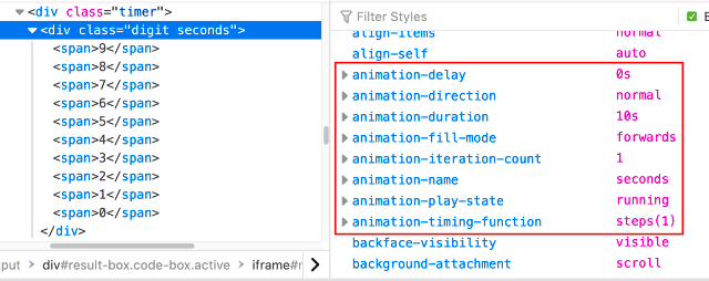
If you open DevTools on the demo, and go to the Computed tab (for Firefox or Safari, Chrome displays this list under their box model in Styles), you will see the computed values for each of the different CSS properties used on your page.

From there you can see that the animation shorthand I used explicitly covers the following properties:
-
animation-nameThis is used to identify the animation, and you can use any combination of case-sensitive letters
atoz, numerical digits0to9, underscores, and/or dashes.The first non-dash character must be a letter though, and you cannot use
--nor reserved keywords likenone,unset,initialorinheritto start the name. -
animation-durationThis sets the length of time your animation should take to complete 1 cycle. So for the seconds column of digits, I set it to
10swhile for the milliseconds column of digits, I set it to1s. -
animation-iteration-countThis sets the number of times the animation should cycle through before stopping. The seconds column only needs to run once, while the milliseconds column needs to run through its animation cycle 10 times.
-
animation-timing-functionThis describes how the animation progresses throughout the duration of each cycle. Timing functions can be fairly granular if you are familiar with
cubic-bezier()functions but I most often see people use keyword values for general use-cases.I used the
step-endkeyword, which resolves tosteps(1, jump-end). Thesteps()function allows us to have stepped animation, where the first argument indicates the number of stops during the transition. Each stop is displayed for an equal amount of time.jump-endallows me move my<div>upward in steps instead of a smooth scroll, and pause at the end value oftranslateY. This is a terrible sentence and even more horrible explanation.Please refer to Jumps: The New Steps() in Web Animation by Dan Wilson for a much better explanation. Visual demos and code in there!
-
animation-fill-modeThis lets you dictate how a CSS animation applies its styles to the target before and after the animation runs. I wanted the position of my
<div>s to remain at the last keyframe when the animation ends, so I set this value toforwards.
For the seconds digit, the last 2 frames don’t need to be shown at all because the timer is not zero-padded. When the countdown hits 9, the seconds digit needs to not show up nor take up space. So those keyframes have an additional width: 0 property on them.
Also, because I went with forwards for the animation-fill-mode, to make the 0 stay on screen at the end of the animation, the last frame for milliseconds remains at -9em.
Read more about CSS animations in the CSS Animations Level 1 specification. It broadly explains how animations work in the context of CSS, then covers in detail each of the individual animation properties. Also, examples of working code aplenty.
Flexbox
This is my favourite part. The requirement is that during the last second, when only the digits 9 to 0 remain on display, the whole timer has to be aligned center.
Here’s where it is time to reveal the Javascript solution, which is honestly, much more straightforward. The key here is Window.requestAnimationFrame(). Here’s the MDN entry for it.
You’re welcome.
let end;
const now = Date.now;
const timer = document.getElementById("timer");
const duration = 9900;

function displayCountdown() {
  const count = parseInt((end - now()) / 100);
  timer.textContent =
    count > 0 ? (window.requestAnimationFrame(displayCountdown), count) : 0;
}

function start() {
  end = now() + duration;
  window.requestAnimationFrame(displayCountdown);
}
This implementation is also so much easier to style, because Flexbox.
<div class="timer-container">
  <p class="timer" id="timer">99</p>
</div>
.timer-container {
  display: flex;
  height: 100vh; /* height can be anything */
}

.timer {
  margin: auto;
}
When I started this post, I already said, just because you can do something with pure CSS doesn’t mean you should. This is the prime example. Anyway, here’s the Codepen with the same enhanced-for-demo-purposes functionality sprinkled on.
See the Pen Countdown from 99 to 0 by Chen Hui Jing (@huijing) on CodePen.
But let us continue with the pure CSS implementation, even if it is just an academic exercise at this point.
.timer-container {
  display: flex;
  height: 100vh; /* height can be anything */
}

.timer {
  overflow: hidden;
  margin: auto;
  height: 1em;
  width: 2ch;
  text-align: center;
}

.digit {
  display: inline-block;
}

.digit span {
  display: block;
  width: 100%;
  height: 1em;
}
If you compare this with the Javascript implementation, you’ll notice a lot of similarities.
Yes, my friends. If you had suspected that I was using the modern-day CSS answer to vertical centring on the web, you are absolutely right. Auto-margins is the mechanism in play here.
To be fair, the display: flex and auto-margin on flex child technique centralises the whole timer block. Within the timer itself, the text should be centre-aligned with the text-align property.
Read more about Flexbox in the CSS Flexible Box Layout Module Level 1 specification. It is the definitive resource for how Flexbox works and even though it is fairly lengthy, there are plenty of code examples in there to help you visualise how things work.
Fun demo extra #1: Dynamic colour changing
Another requirement was for the font colour and background colour to be customisable. I’m pretty sure she meant in the code and not on the fly, but since we can do this on the fly, why not?
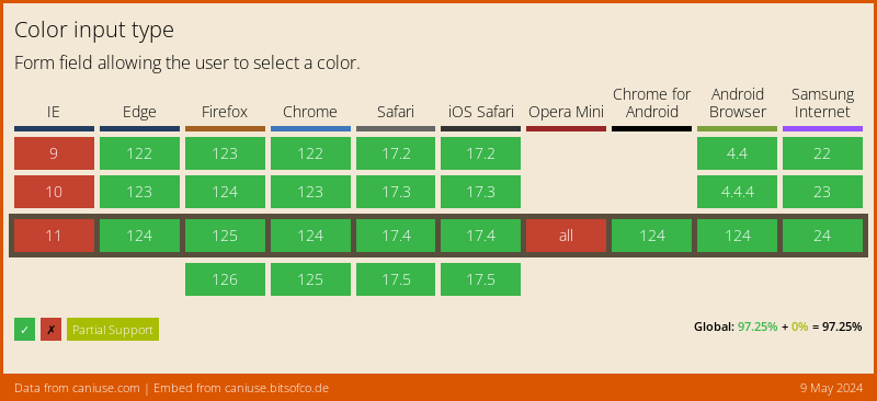
Cue CSS custom properties and the HTML colour input. Before you ask me about support for the colour input, I shall invoke first strike and display the caniuse chart for it.
Come on, this is pretty green here. So anyway, declare your custom properties for font colour and background colour like so:
:root {
  --fontColour: #000000;
  --bgColour: #ffffff;
}
Use them in the requisite elements like so:
.timer {
  /* other styles not shown for brevity */
  background-color: var(--bgColour, white);
}

.digit {
  /* other styles not shown for brevity */
  color: var(--fontColour, black);
}
That’s the set up for the timer itself. Now, control these colours with the colour input. Toss in 2 colour inputs into the markup and position them where you like. I went with the top-right corner.
<aside>
  <label>
    <span>Font colour:</span>
    <input id="fontColour" type="color" value="#000000" />
  </label>
  <label>
    <span>Background colour:</span>
    <input id="bgColour" type="color" value="#ffffff" />
  </label>
</aside>
Then, you can hook up the colour picker with the custom properties you declared in the stylesheet like so:
let root = document.documentElement;
const fontColourInput = document.getElementById('fontColour');
const bgColorInput = document.getElementById('bgColour');

fontColourInput.addEventListener('input', updateFontColour, false);
bgColorInput.addEventListener('input', updateBgColour, false);

function updateFontColour(event) {
  root.style.setProperty('--fontColour', event.target.value);
}

function updateBgColour(event) {
  root.style.setProperty('--bgColour', event.target.value);
}
It’s not that much code, and kind of fun to play with in a demo, IMHO.
Fun demo extra #2: Checkbox hack toggle
I could have left the demo to start automatically when the page loaded and letting people refresh the page to start the animation again, but I was going all in with the pure CSS thing, so…
Anyway, checkbox hack plus overly-complicated selectors. That’s how this was done. If you had just gone with Javascript, which is probably the right thing to do, you could used a button with an event listener. But you’re too deep in this rabbit hole now.
I built this bit such that when unchecked, the label shows Start but when the input is checked, the label shows Restart. Because why not make things more complicated?
.toggle span {
  font-size: 1.2em;
  padding: 0.5em;
  background-color: palegreen;
  cursor: pointer;
  border-radius: 4px;
}

input[type="checkbox"] {
  opacity: 0;
  position: absolute;
}

 input[type="checkbox"]:checked ~ aside .toggle span:first-of-type {
  display: none;
}

.toggle span:nth-of-type(2) {
  display: none;
}

input[type="checkbox"]:checked ~ aside .toggle span:nth-of-type(2) {
  display: inline;
}
The actual bit that triggers the animation looks like this:
input[type="checkbox"]:checked ~ .timer .seconds {
  animation: seconds 10s 1 step-end forwards;
}

input[type="checkbox"]:checked ~ .timer .milliseconds {
  animation: milliseconds 1s 10 step-end forwards;
}
With the checkbox hack, the order of the elements on the page does matter because you can only target sibling selectors after an element and not before it. So the checkbox needs to be as near the top (and not nested) as possible.
Wrapping up
Truth be told, I think I’m a terrible technical writer because most of my posts are so long I reckon only a tiny handful of people ever read through the whole thing.
But this is my blog, and not some official documentation, so I’m kinda going to keep doing whatever and writing these ramble-y posts.
At least I try to organise the content into coherent sections? Okay, to be fair, if I was writing for a proper publication, I’d put on my big girl pants and write concisely (like a professional, LOL).
Unfortunately, this is not a proper publication. ¯\_(ツ)_/¯ Anyway, much love if you really made it through the whole thing. Hope at least some of it was useful to you.
Credits: OG:image from autistic.shibe’s instagram
