I recently got the opportunity to visit the Mozilla Community Space in Jakarta and speak at MozKopdar JKT with Alex Lakatos. Instead of using slides, which was my normal mode of delivery, I decided to go with presenting the concepts and techniques I wanted to share directly through DevTools. It turned out better than I expected.
This made me start to think about the role of DevTools in a broader context. The primary role of DevTools is debugging, but it can also serve as a means of visualising how the browser interprets the code we write, especially for CSS layouts. A big help for understanding the newer layout techniques.
The modern layouts triple team of Flexbox, Grid and Box alignment introduces certain concepts that may be harder to visualise than previous layout methods. And this is where Firefox DevTools, IMHO, does a great job of facilitating that visualisation.
Flex Inspector Tool
Let’s start with Flexbox. If sizing in Flexbox has always been an enigma to you, I highly recommend reading Rachel Andrew’s excellent breakdown, Flexbox: How big is that flexible box? on Smashing Magazine.
As of time of writing, the only browser with a Flex inspector tool is Firefox, and all the featured examples use Firefox Nightly (v66.0a1 (2018-12-19)). It uses a similar interface as the more well-known Grid inspector tool, where you toggle the tool via an icon next to the display property value.
After toggling the flex overlay on the parent element, we can also observe what’s going on for each flex child. Information on the flexibility and size of the flex child can be seen on the layout panel.
When it comes to explaining concepts, I found that it was much more effective to talk through what’s going on while resizing the browser, changing certain values via DevTools and immediately seeing the corresponding effect on the screen.
For example, it was easier to grasp the content-based sizing values of max-content, min-content and fit-content() when they were demonstrated live in the browser.
Box alignment visualised
The flex overlay also inadvertently became a visualisation tool for the various box alignment properties, largely because of how it was designed. Free space is indicated by a pattern of dashed lines and dots, which makes it clear how free space is being distributed when the different values are applied.
I found this particularly helpful for getting people to remember that the default behaviour of flex items is to stretch to fill the available space on a flex line, i.e. every flex item on the line will end up being the same height (in a row direction) as the tallest item on the line. Sometimes words may be confusing, and visuals can help.
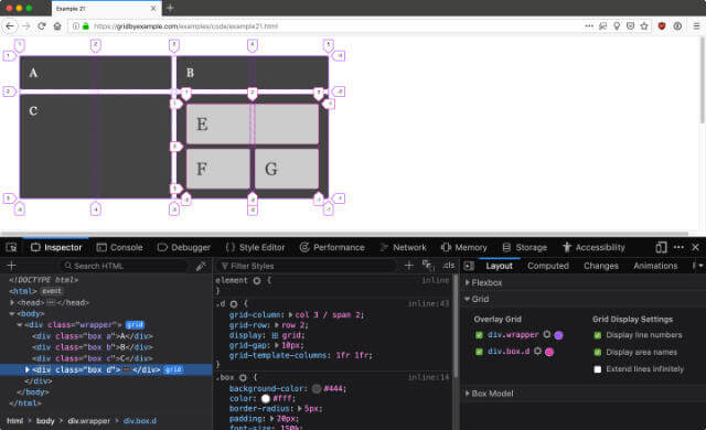
Such behaviour is also observable when the Grid overlay is applied, and given that Firefox also has, by far, the best Grid inspector tool among all the browsers, let’s talk about it too.
Grid inspector tool
Firefox shipped its Grid inspector tool way before any other browser, and they have continued to work on adding more features, and fixing bugs based on feedback from users. As such, the Grid inspector tool has become an indispensable part of my workflow when designing layouts with Grid.
Let’s start off with the most useful basic features. The ability to see grid lines labelled with grid numbers. But more than that, we are free to change the colour of the grid overlay, useful for real-world projects where the background colour is very close to the default overlay colour and you need more contrast between the two to see what’s going on.
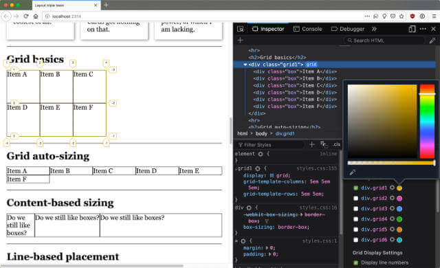
One of the key improvements since Grid was first released was the way line number labels are handled at the edge of the viewport. For some of my designs, I built the grid to encompass the maximum width and height of the viewport, so in earlier iterations of the Grid inspector tool, those labels got cut-off.
What I appreciate a lot is that the DevTools team took user feedback into account and continued to improve the tool after it was first released. Among other improvements, the position of line number labels have since been adjusted so they are always visible.
A relatively newer feature improvement is the ability to have multiple grid overlays displayed at the same time. This is especially useful for designs that utilise grid in a more complex manner, perhaps overlapping grids or nested grids.
Observing varying rates of change
One of the most interesting features in Flexbox and Grid is how there is a possibility to vary the rate of growth or shrinkage of elements, and affect who shrinks first, or holds their size as long as possible.
I was first clued into such behaviour about one year ago when I met Jen Simmons at the Mozilla All-Hands in Austin. I think we spent around an hour changing grid values and resizing the browser. I mean, isn’t resizing the browser a thousand times a day part of the job description? But I digress.
At first it was just an interesting observation, but after Jen introduced the world to Intrinsic Web Design and showed a number of concrete examples behind its 6 broad concepts, I started to think more about the practical applications of such behaviour.
Prior to flexible sizing, if we wanted designs that would adjust to the width of the viewport, our only option was relative sizing, with percentages (or viewport units, if you were adventurous). But sizing elements using these units meant they grew and shrunk at the same rate, regardless of what type of content it was.
Sometimes images grow and shrink too much at the more extreme viewport sizes, or certain blocks of text with different font sizes might not display at a comfortable reading width. We could get around this by adding more breakpoints, which meant multiple blocks of layout code per breakpoint.
There’s nothing wrong with that approach, but what I want to highlight is that we have more options now, and varying rates of change is a new design tool we can utilise for building layouts.
Strength of flexible widths
Strength is probably a rather bad way of putting it, but I want to make a distinction between how items with different sizing values hold their widths differently depending on the sizing values of other items within the same context.
fr versus auto versus minmax()The above example uses Grid, because as of time of writing, it supports the plethora of flexible sizing values available to us. If you are reading this years in the future from 2018, maybe these values could be used in more formatting contexts already (keeping my fingers crossed).
For tracks sized with fr, because it’s defined as the fraction of leftover space in the grid container, it will absorb all of the additional free space as the viewport continues to grow beyond the space required by non-flexible tracks.
But it is also the first to lose its width when free space is being taken away, to the point where it will shrink to its min-content first, before the tracks sized with other values.
When you use auto, the track behaves like max-content when there is an abundance of space. The grid formatting context is a special case. Because the initial value of justify-content is normal, which behaves like stretch, all the auto tracks stretch out, beyond the max-content width of the track. (Hopefully this makes sense)
But when space is limited and shrinking, the width of the track becomes the largest minimum size of whatever content is within the grid item. So with reference to my demo, if you keep reducing the size of the viewport, the auto track will shrink until the width of the word “boxes?” before overflowing.
The minmax(min, max) value can be considered the ‘strongest’ at holding onto its maximum width as the viewport shrinks. If there are any fellow tracks sized with fr, those will be first to shrink.
Given that auto is supposed to behave like max-content but is stretched out because of the default alignment property, that stretched-out space is the next to go.
But once the max-content width is hit, an auto track will shrink together with any minmax() track. And they will reach their minimum size at the same time! You can verify this by checking the width of the grid item with DevTools as you gradually adjust the viewport.
See the Pen Flexible sizing: the ultimate comparison by Chen Hui Jing (@huijing) on CodePen.
Let’s also talk a bit about fit-content(). This particular track size will have a maximum size of max-content or whatever width was within the parentheses, whichever is smaller. So if there’s a lot of content, you can clamp the maximum width at a certain value. If the amount of content is less than the value within the parentheses, the track size end up being max-content.
This example is best played with live, so I’ve ported it to Codepen ☝️. Please open it up in a new window and resize the page until you grok the behaviour of all the various available values. That’s what I did.
Building an actual design
I was also writing another article about flexible sizing for LogRocket and came up with an example design for a feature header. I relied very heavily on DevTools to experiment with the values I needed to get the effect I wanted, especially for the spacer tracks.
See the Pen CSS sizing: different content types by Chen Hui Jing (@huijing) on CodePen.
Even though I knew how flexible sizing worked in my head, putting it all together in a grid where items overlapped and spanned multiple flexible tracks was impossible to do without visualising it in the browser. So cue DevTools to the rescue.
Bonus: CSS shapes
Update: Adrian Roselli, who wrote a brilliant article on using CSS shapes to build a CSS Venn Diagram, so kindly sent over a screencast of the Shapes Editor within DevTools so I’ve added this new section on CSS shapes.
CSS shapes has been around for a while now, and it’s one of those CSS properties that “fails” really well. Unless you’re doing something overly elaborate, if the browser does not support CSS shapes, your layout will behave as though you didn’t apply Shapes at all.
I wrote about CSS shapes back in 2015 after listening to Jen Simmons talk about it on her podcast, The Web Ahead and reading Sara Soueidan’s seminal article on CSS shapes before anyone else was really talking about it.
See the Pen Fun with CSS shapes by Chen Hui Jing (@huijing) on CodePen.
In a nutshell, CSS shapes is used together with floats to allow text to flow around geometric shapes or images. Such an effect is often seen in magazines and newspapers, but the web could not achieve such an effect before this property was developed. The only workaround being making the text part of the image, skewering accessibility.
Chrome and the webkit-based browsers shipped CSS shapes first, back in 2014. Chrome supported CSS shapes highlighting through DevTools, allowing developers to see the areas their defined shapes took up, and any margins applied (via the shape-margin property).
See the Pen Wrapping text to an image with CSS Shapes by Chen Hui Jing (@huijing) on CodePen.
Firefox released CSS shapes support behind a flag in v51 and made it official in v62. In addition to shipping support for the property in the browser, the team also released the Shapes editor tool. Josh Marinacci wrote a feature on Mozilla Hacks showcasing what the tool can do.
Adrian Roselli wrote a fantastic article about creating a pure CSS Venn diagram using CSS grid and the shape-outside property, which I highly recommend reading. The end result not only fallbacks gracefully, it is also accessible to screen readers by default. It’s a wonderful use-case of what CSS shapes can do for creative layouts on the web.
The Shapes editor tool allows developers who are using either CSS shapes or the clip-path property to manipulate and experiment with basic shapes and polygons. The generated polygon function can then be used in your actual code once you’re satisfied with the results.
Wrapping up
I hope that this helps anybody who’s trying to wrap their head around how flexible sizing works, and that you’ll try it out yourself. Because there’s no better teacher than resizing your browser a thousand times and seeing what happens. I’m only sort of joking here.
But I’m also excited to see what designers and developers create once we’ve all gotten used to sizing that holds width depending on its own value and the value of other items within the same context. I think such behaviour opens up a lot of options for designing layouts across a broad range of viewport sizes without heavy reliance on breakpoints.
That’s exciting to me. And I hope it’s exciting for you too! 🤩