Since I started my career on the web, I’ve been building websites that follow standard grid layouts. It got to a point where I was telling an intern at my company that developers think in rectangles. I mean, there’s nothing wrong with rectangular layouts. They’re like your mom’s Volvo, steady and reliable. But sometimes, it’s fun to try something different. I’m lucky enough to work with some awesome designers, and for a new project, they came up with a diamond-based grid layout. Well then, challenge accepted. (•̀o•́)ง
Attempt 1: Just rotate them divs
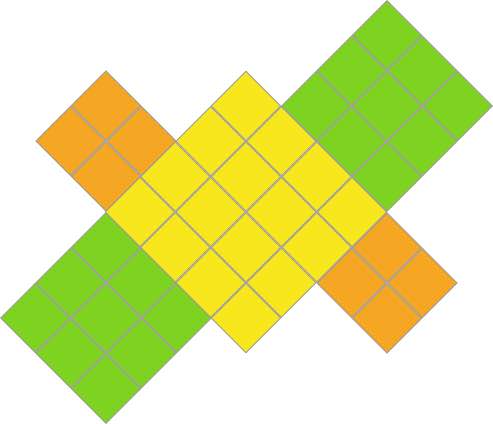
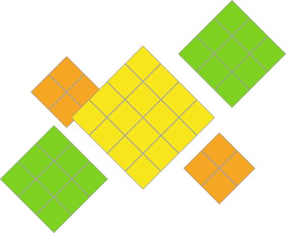
On the first pass, I hadn’t gotten my hands on the actual design yet, but started experimenting with HTML and CSS first, just to try out a few ideas I had. The first thing that came to mind was using CSS transforms, considering I had already written about it earlier. Nothing a little transform: rotate(45deg) couldn’t do, right? Unfortunately, things weren’t all that straightforward. The general layout consisted of 2 small diamonds, 2 medium diamonds and 1 large diamond, all aligned to relative to each other on the grid. There would also be an alternate layout to switch things up a bit.
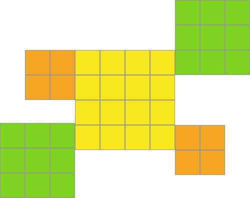
The initial mark-up for the grid was pretty simple. A wrapper for the entire grid, individual wrappers for each diamond and some placeholder content.
<div class="grid-wrapper layout-1">
    <div class="grid-item diamond-small diamond-s1">
        <div class="diamond__content">
            <p>small diamond</p>
        </div>
    </div>
    <div class="grid-item diamond-med diamond-m1">
        <div class="diamond__content">
            <p>medium diamond</p>
        </div>
    </div>
    <div class="grid-item diamond-large">
        <div class="diamond__content">
            <p>large diamond</p>
        </div>
    </div>
    <div class="grid-item diamond-small diamond-s2">
        <div class="diamond__content">
            <p>small diamond</p>
        </div>
    </div>
    <div class="grid-item diamond-med diamond-m2">
        <div class="diamond__content">
            <p>medium diamond</p>
        </div>
    </div>
</div>
Sass variables came in very handy in this case as I could create a grid-unit to use as a base for calculating the widths of all the diamonds. I used an arbitrary number of 95vw / 16 as the base unit just to see if it would work.
$gridUnit: 95vw / 16;
$small: $gridUnit * 2;
$med: $gridUnit * 3;
$large: $gridUnit * 4;
Some of you who are much smarter than me would immediately recognise that this method would NOT work, at least not without some trigonometry, because you can’t just rotate a bunch of positioned squares and expect them to end up aligned just right.
Attempt 2: Clip off them divs
That didn’t go so well. Next idea on the list, CSS clip-path. This CSS property allows us to define a specified clipping region to be displayed. Anything outside this region will ‘clipped’ and won’t be seen. The clipping region can be a path specified as a URL referencing an inline SVG or an external SVG. It can also be a shape method, like those used for CSS shapes. Unfortunately, support for CSS clip-path is non-existent for any version of Internet Explorer. Firefox only supports the url() syntax, while Chrome supports shapes and inline SVG for the url() syntax, but not external SVG. I managed to find a cross-browser polyfill for CSS clip-path, which should help.
The idea is that each diamond is actually just a square unit with its corners clipped off, so the length of one square is the diagonal of the diamond. Tweak the variables a little bit, and voila:
See the Pen Diamond grid with Sass (Clip-path) by Chen Hui Jing (@huijing) on CodePen.
At this point, it seemed that I’d cracked the diamond-grid layout my designer wanted, but I hadn’t looked closely at the actual visuals and art direction. I just assumed it was a grid of diamonds in the background, something I could probably do with CSS. It would also make things easier to line up as they would be using the same base units. I came up with something like this:
See the Pen CSS diamond background by Chen Hui Jing (@huijing) on CodePen.
And then I saw the actual hi-fidelity design. In a nutshell, this grid layout was meant for an image heavy site, essentially serving as a gallery of sorts. The background was made up of tiles of textured diamonds. And there would be highlights on some of the corners of the display diamonds to make them pop. Oh, and also, let’s have some box shadows inside each display diamond as well, but only for those displays that contain images. ༼⊙_⊙༽
Okay, back to the drawing board.
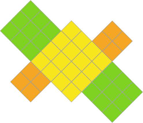
Attempt 3: High school math to the rescue
My third attempt was actually just a reboot of the first attempt. These diamonds are simply squares that got rotated, so I had the benefit of working with isosceles right triangles, which made calculations much neater.
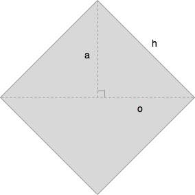
Since the adjacent and opposite sides of the triangle were equal, the width of each diamond would be the length of the hypotenuse (or the side of the square) divided by the square root of 2. Now here’s the tricky part, there is no direct way to calculate the square root of a number using CSS or Sass. Sorry, no Math.sqrt() for you. ¯\_(ツ)_/¯
The good thing about Sass is you can write your own functions and I, admittedly, being too lazy to write my own, just sourced for a square root function created by Mihai Vaduva:
@function sqrt($r) {
    $x0: 1;
    $x1: $x0;
    @for $i from 1 through 10 {
        $x1: $x0 - ($x0 * $x0 - abs($r)) / (2 * $x0);
        $x0: $x1;
    }
    @return $x1;
}
Update:
Someone pointed out to me that the square root of 2 is a constant and could have just been hard-coded. To quote the famous American philosopher, Homer Simpson, “D’OH!” 😫
Now my Sass variables for calculating the grid layout looked like this:
$gridUnit: (100vw / 8);
$transformUnit: $gridUnit / sqrt(2);
$small: $transformUnit * 2;
$med: $transformUnit * 3;
$large: $transformUnit * 4;
There was no way around positioning each display diamond absolutely, at least, I couldn’t think of an alternate way (suggestions are welcome). I tried to structure my classes as efficiently as I could. If history is anything to go by, I’ll probably look back at this and nitpick how I would have written it differently. For now, it’s a long chunk of sizing and positioning based off the base units I established as variables. Couldn’t possibly do this without Sass though.
See the Pen Diamond grid with Sass (Transform) by Chen Hui Jing (@huijing) on CodePen.
Visual styles and art-direction
Using CSS to rotate the divs solved the problem of having inner shadows on the diamond displays that were to contain images. As for the background, I ended up tiling a pattern image, then aligning my divs to match up with the pattern. Using viewport widths (vw) as the basis for my grid units meant the layout would respond to screen size. Hence, my background image pattern would also have to grow and shrink according to the viewport width as well.
The problem with this approach is, unless your background image is sized very precisely, it is almost impossible to match the browser-calculated divs with the grid on the image exactly over a large range of screen sizes. A tiny 1 pixel misalignment at a small width usually became very evident at large widths. As the project I was working on wasn’t exactly a fully responsive design, I could get away with it within a smaller range of screen widths.
body {
    @media screen and (min-width: 1000px) and (max-width: 1919px) {
        background: url('../img/bg-tile.jpg') repeat-y;
        background-size: contain;
    }
}
The trick was to use background-size: contain for the background image. According to MDN, the browser will scale the image as large as it can while maintaining aspect ratio. This coupled with repeat-y gave me a background image that scaled with the viewport width. I tried to make the background tiles the same size as my Sass grid units but I’m pretty sure they were 1 or 2 pixels off. The discrepancy wasn’t very obvious within the constraints of my media query though, so I was fine with that.
The highlights at certain corners of the display divs were added using the :before and :after pseudo-elements on the display divs themselves. These highlights were also were positioned absolutely, and I used the same Sass grid unit values to position them in the correct spots.
Wrapping up
This was a very interesting project to work on and really stretched my knowledge and skills as a developer. There was a lot more to this project than just layout, but it was the base off of which the rest of the design was built upon. CSS properties like clip-path, transforms and my personal favourite, CSS shapes, provide us a lot of flexibility to explore different layouts. While starting out research for this project, I came across this article by Trevor Davis who also had to build a diamond grid for his project. It seems that we’re starting to break out of the constraints of rectangular layouts, and I’m confident that as CSS becomes more robust, we’ll be able to pull off more creative designs in the future.