After a couple of rounds of introducing CSS grid to people who haven’t tried it before, I found it wasn’t the implementation of grid that people asked questions about, rather, it was the bit before that. The actual planning of how a layout would be set up.
If you read the previous post on teaching CSS grid to newcomers, one of the analogies I used was the one about gardening, i.e. curating exactly where your plots of hydrangeas, roses and tulips would turn up. Okay, lost you there. I guess horticulture isn’t everyone’s thing 🤷.
But to be honest, I’ve found myself using a pencil and paper to sketch out my grids a lot more since I’ve started designing and building with CSS grid. The grid syntax itself is very visual in nature and I always highlight this fact when I’m teaching Grid.
Look at the syntax for a simple grid:
.grid {
  display: grid;
  grid-template-columns: 150px 150px 150px;
  grid-template-rows: 200px 200px;
}
You can already tell that the grid takes 3 columns and 2 rows. And this is even more evident with grid-template-areas, which I am quite fond of as well.
.grid {
  display: grid;
  grid-template-columns: 12em 1fr 15em;
  grid-template-rows: 10em 20em 1fr 10em;
  grid-template-areas: 'a a b'
                       'c d d'
                       'c d d'
                       'e e e';
}

.grid-item__a { grid-area: a; }
.grid-item__b { grid-area: b; }
.grid-item__c { grid-area: c; }
.grid-item__d { grid-area: d; }
.grid-item__e { grid-area: e; }
It is quite intuitive to visualise the grid in your browser in the manner in which the code is being laid out. And that’s fantastic, I don’t think we have any other properties that behave in this manner at all. A visual presentation requires a visual tool, and we get that with CSS grid.
So in broad strokes, this is my process for “web-ifying” a static print design, or whatever else was my source of inspiration at the time.
- Examine all the elements on the original design
- Translate the design onto a pencil and paper sketch
- Work out how the grid needs to be structured so it can morph around different viewport sizes nicely
- Designate flexible and fixed tracks as per the design
- Start building out the design in code and view on the browser
- Adjust and tweak track sizes until fully cooked, oh wait, sorry, this isn’t a recipe for one-pot cheesy chili 😏
Though I wasn’t kidding about the adjust and tweak part. I resize the browser way too often than the average web user considers normal. Like exponentially more often 😌.
Use-case: Tycho artist profile
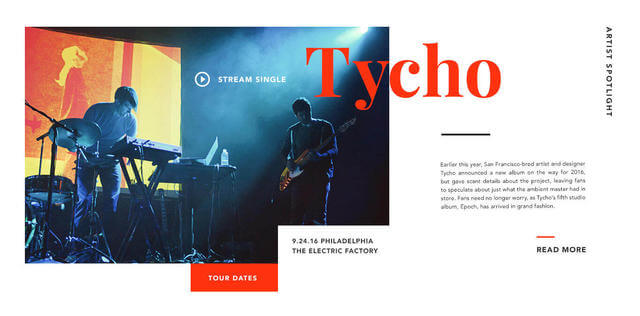
I came across this design on Dribbble and immediately thought to myself, hey I can totally do that on the web, and not as an image. I was familiar with Tycho because I used his album covers as inspiration for my first ever conference talk at CSSConf.Asia back in 2016.
Examine
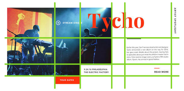
The design can be broken up into 6 columns and 4 rows. Maybe you see things differently, you could intuitively see 5 columns or something else, and that’s totally fine. My take on design is very laissez-faire, you-do-you, so come up with whatever works well for you.
Translate, structure & designate
Pencil and paper is cheap and quick. It lets me iterate in my head how I want my tracks to behave, while helping me visualise the final effect. A question I get from people who first notice my grid structure is why do I have that fourth (from the left) flexible column?
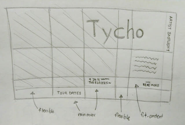
I chose to put in an extra column for more control over the flexible spacing I wanted to have between the main text and the feature image. But there’s always more than one way to skin a cat when it comes to doing CSS, and if you want to have less columns, do that.
Finally, code time!
Build
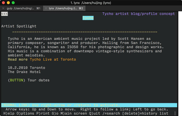
Always mark-up first. Regardless of what the kids are doing these days, I stick by my guns and start with mark-up first. A fun experiment (maybe not for you, but definitely for me) is to see how your site reads on Lynx. It does serve as a good gauge of whether the content on the site is structured properly or not.
Basic visual styling next, things like fonts, colours and text formatting. Because browsers have their own styles, I do some minimal resetting of my own, just for margins and paddings, as well as set box-sizing to border-box by default. Just a personal preference.
main {
  max-width: 45em;
  margin: 0 auto;
  position: relative;
  padding: 1em;
}

_:-ms-input-placeholder, :root main {
  display: block;
}

h1 {
  font-family: $header-font;
  color: $accent;
  font-size: calc(3em + 7vw);
  margin-bottom: 0.25em;
}

h2 {
  text-transform: uppercase;
  font-size: calc(1em + 0.5vw);
  color: lighten($text, 50%);
  margin-bottom: 1em;
}

hr {
  opacity: 0;
}

.about {
  line-height: 1.3;
  margin-bottom: 1em;
}

a {
  display: block;
  text-transform: uppercase;
  text-decoration: none;
  color: $text;
  margin-bottom: 2em;
  font-weight: bold;
}

img {
  width: 100%;
  height: 100%;
  object-fit: cover;
}

.location {
  text-transform: uppercase;
  line-height: 1.5;
  font-weight: bold;
}

button {
  border: 0;
  background-color: $accent;
  color: $main;
  text-transform: uppercase;
  font-size: 100%;
  padding: 1em 2em;
  position: absolute;
  right: 1em;
  bottom: 1em;
}
The base layout should make use of CSS that is almost universal, i.e. properties that are supported everywhere. Even though I always say web pages don’t need to look exactly the same in every browser, broken is NOT a design pattern, my friends. This base layout may look a little plain and boring, but hey, if I want to go see Tycho, all the information is there for my comfortable consumption.
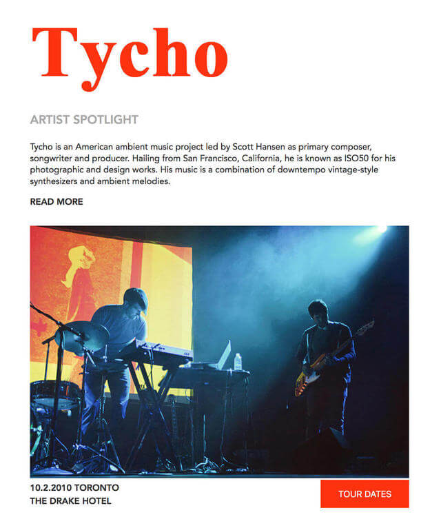
Now, we can start doing the fun stuff of playing with grid. I chose to go with flexible units like fr and viewport units because I wanted the layout to fully occupy the window without overflowing, when space allowed. So if you look at my grid-template-columns property, it looks a little nuts if you’ve never used grid before.
And all the rows are relative to the viewport height, which can get a little tricky. I can’t remember exactly what my initial values were any more, because there were a few rounds of adjustments, followed by manic browser resizing, then more adjustments… You get the picture.
Adjust, tweak, rinse, repeat
Eventually I settled on this:
@supports (display:grid) {
  @media (min-width: 42em) and (min-height: 27em) {
    main {
      max-width: none;
      padding: 0;
      display: grid;
      grid-template-columns: 2fr minmax(10em, max-content) minmax(14em, max-content) minmax(1em, 1fr) fit-content(28em) calc(2em + 0.5vw);
      grid-template-rows: 35vh 40vh 15vh 10vh;
    }

    h1 {
      grid-column: 3 / 6;
      grid-row: 1 / 2;
      z-index: 2;
      padding-left: 0.25em;
      margin-bottom: initial;
    }

    h2 {
      grid-row: 1 / -1;
      grid-column: 6 / 7;
      writing-mode: vertical-rl;
      margin-bottom: initial;
      color: $text;
    }

    hr {
      grid-column: 5 / 6;
      grid-row: 2;
      height: 6px;
      background-color: $text;
      width: 20ch;
    }

    .about {
      grid-column: 5 / 6;
      grid-row: 2;
      align-self: end;
      padding-bottom: 4vh;
      margin-bottom: initial;
    }

    a {
      grid-column: 5 / 6;
      justify-self: end;
      align-self: center;
      margin-bottom: initial;

      &::before {
        content: '';
        display: block;
        height: 4px;
        background-color: $accent;
        width: 4ch;
        margin-bottom: 1em;
      }
    }

    img {
      grid-column: 1 / 4;
      grid-row: 1 / 4;
    }

    .location {
      grid-column: 3 / 4;
      grid-row: 3 / 4;
      z-index: 2;
      background: $main;
      text-align: center;
      display: flex;

      p {
        margin: auto;
      }
    }

    button {
      grid-column: 2 / 3;
      grid-row: 4 / 5;
      position: initial;
      padding: 0;
    }
  }

  @media (min-width: 48em) and (min-height: 27em) {
    hr {
      opacity: 1;
    }
  }
}
The min-height query was put in there to take care of the black line underneath the main header. The thing about using viewport units for layout is, there will definitely be points where the layout breaks. Which is why media queries are quite essential. So you can switch out of viewport units when the context no longer makes sense.
Here’s the final end result in action:
And the CodePen, if that’s more your thing. I suggest viewing in Full Page mode so you can have fun with resizing too 🤣.
See the Pen Tycho Artist Profile by Chen Hui Jing (@huijing) on CodePen.
The original inspiration worked best on a landscape view, and just because it doesn’t work well on a portrait orientation doesn’t mean we can’t adopt it. Our job is to think about designing for a dynamic medium, and I find that incredibly rewarding, and fun, to be honest.
What other medium exists where we don’t just think in one fixed dimension? We get to think about how our design will morph on a narrow screen, or on an older browser, in addition to how it will appear on a browser with the latest features. And to me, that’s what makes our medium really special.
Wrapping up
I genuinely believe that CSS grid will encourage designers and developers to explore more creative layouts and rely less on pre-canned CSS frameworks because of its intuitive yet powerful nature. I don’t think CSS frameworks will go away, and there are definitely use cases for them, but I look forward to a time when CSS grid is THE go-to technique for building layouts on the web 😎.