My interest in language, writing systems and typography has led me to spend hours down a rabbit hole in search of answers to the plethora of “how/why did this come about?” questions that pop into my head at random. I may have an ”easily distracted” issue, but we’re not talking about that today 😈.
As I was polishing up my talk for You Gotta Love Frontend last year, I started digging into digital font formats. At the time, I was trying to come up with an easy-to-explain definition for fonts. And I came across some good ones, which often make the contrast between fonts and typefaces, from this article by Yves Peters.
…the physical embodiment of a collection of letters, numbers, symbols, etc. (whether it’s a case of metal pieces or a computer file) is a font.
—Mark Simonson
font is what you use, and typeface is what you see.
-Norbert Florendo
But after figuring out what fonts actually were, I wanted to know how digital fonts worked. I did eventually finish my talk, just that I got slightly sidetracked along the way. This is going to be another “brain dump” post. You have been warned.
TLDR: digital font formats are simply another type of data format, which store information about the font based on each format’s respective specifications.
Increasing layers of abstraction
In my mind, digital is transient, it is an encoding and manipulation of electronic signals. And as digital technology continues to progress (at a breakneck speed, might I add), we see less and less of the actual physical manifestations of it.
As someone who is generally curious about how things work under the hood, and why things came to be a certain way, I found books like The Dream Machine, Where Wizards Stay Up Late and When Computers Were Human as well as podcasts like the Internet History Podcast, particularly interesting.
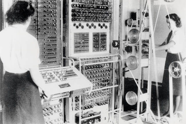
It wasn’t that long ago when computers surrounded human beings (like the Colossus or the ENIAC) and the rate of computation, though fast, was still somewhat visible to the human eye.
In a couple of decades, processor sizes have shrunk exponentially, while their speeds have increased exponentially. It’s gotten to a point whereby if you showed someone from the 19th century your smart phone, they might think it’s magic (or call you a witch, I don’t know, times were different).
And I don’t think I’m wrong to say that about most of us these days either. Maybe we don’t think it’s magic per se, but most people don’t know how their computers even work (and probably don’t care as long as it does).
Analogue fonts
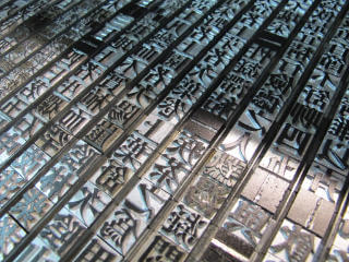
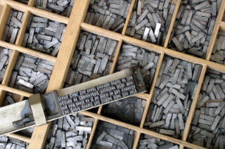
Before digital, when we talked about fonts, we were usually referring to metal typesetting, where fonts were the complete set of metal types that were used to typeset entire pages of text. Those were in use for hundreds of years until today, for use in letterpress printing.
We also have fonts that look like this:
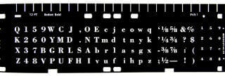
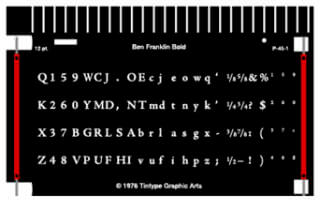
And these were used in phototypesetting. They served as a bridge between analogue and digital, because the fonts were, in a way, physical objects, but working with those fonts required a digital display.
So the question is, how did we get from fonts that we could hold in our hands, to fonts that only existed as bits and bytes?
A bit about bits and bytes
Computers are so ubiquitous today that you don’t have to be an engineer or a computer scientist to use one. There was a time when computers were a niche domain, of interest only to enthusiasts and hobbyists who possessed the technical knowledge to operate them. Fast forward to today, many computer users may not know what goes on underneath the hood of their machines.
With GUIs becoming more prevalent and polished, it is totally possible to go about all tasks without knowing what a file system is or where data is stored. But let’s examine the concept of digital data for a little bit. I thought the Crash Course Computer Science series did a really good job explaining a lot of basic computing concepts, and I’ll be referencing information from that video series.
If you think about it, what is a file, exactly, in digital terms? It helps to go back to a time when there were less layers of abstraction between the hardware and the user interfaces.
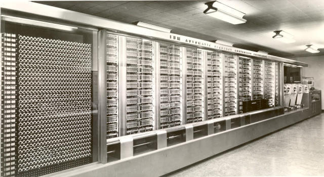
The Harvard Mark I was built by IBM for the Allies during World War II and it was made up of 765,000 components, 3,000,000 connections and 800 kilometres of wire. A 15-metre shaft driven by a 5 horsepower motor was used to keep its internal mechanics in sync. All computations were essentially controlled by mechanical switches, toggling between on and off states.
On and off. 1s and 0s. Bits and bytes. This is why binary is so important when it comes to electronics and computers. Computers run on billions of electronic switches which store binary numbers when electric currents toggle them to either on or off states. Every single data format out there is stored and processed by a computer in the form of binary digits. Digital, get it? (My brain replies, yes, got it.)
File formats are a standard method of encoding information for storage. They usually come with detailed specifications that describe exactly how bits are used to encode information in an electronic medium. These specifications may be freely available (open-source) or proprietary, as sometimes they are considered trade secrets.
Encoding data is one thing, but rendering them on a graphical display is another animal altogether. The development of hardware like graphical terminals and printing devices went hand-in-hand with software advancements like rasterisation algorithms and page description languages.
If you really think about it, anything seen on a screen has everything to do with the field of computer graphics. And digital typography is really a cross-disciplinary field involving technical engineering, aesthetic design and mathematical precision.
Understanding font formats
Yannis Haralambous wrote a very comprehensive book called Fonts & encodings, which was a great help in my understanding of digital fonts. The basic gist of digital font formats was explained as follows:
A font is a container for glyphs. To set a sequence of glyphs, the software calls up a font through the operating system and asks for the glyphs that it needs. The way in which the glyphs are described depends on the font format: PostScript, TrueType, or any of a number of others, all of them quite different.
This then begs the question of what a glyph is. Luckily, the book includes these definitions as well:
A glyph is the image of a symbol used in a writing system (in an alphabet, a syllabary, a set of ideographs, etc.) or in a notational system (like music, mathematics, cartography, etc.).
A character is the simple description, primarily linguistic or logical, of an equivalence class of glyphs.
The issue of characters and glyphs is not as straight-forward as most people think, and this may seem more apparent you if you have an understanding of Asian languages. If this topic is of interest to you, I recommend reading Surface or Essence: Beyond the Coded Character Set Model by Shigeki Moro.
Font formats differ in the manner the glyphs for each character or symbol are stored in their respective font-resource files. A font incorporates character patterns and spacing information, and the contents of character patterns depend on the envisaged representation. (Kohen, 1989).
Bitmap fonts
Bitmaps are made up of a regular rectangular mesh of cells called pixels, with each pixel containing a colour value. Pertinent information for bitmaps are the number of pixels and their colour depth per pixel. Bitmap formats are simply a list of bitmap information, byte by byte, row by row. Such a method results in large file sizes, hence compression is of utmost importance.
The earliest fonts were bitmap fonts, or raster fonts, which stored each glyph as an array of pixels. Think of them as collections of raster images of glyphs. These glyphs are described by black or white pixels. This worked fine for low resolution screens at the time, where each glyph would contain around a hundred pixels or so.
But for high resolution printing, such an approach would result in a single glyph requiring thousands of pixels to render clearly. You can imagine the resulting file sizes. Also, every new font size would call for a new set of character patterns, making them relatively inflexible. The limitations of bitmap fonts triggered the development of outline fonts.
Outline fonts
Outline fonts, or vector fonts, are collections of vector images, which describe glyphs as sets of lines and curves. The advantage of storing font information in such a manner is that they can be scaled without compromising resolution.
However, doing so required considerable more processing power as compared to bitmap fonts, and depending on the rendering engine used and output size required, your mileage could vary when it came to the end result. But the biggest issue with outline fonts was the fact that most screens rendering them were raster displays.
PostScript fonts
John Warnock, founder of Adobe, developed PostScript, which is a programming language for describing the entire printed page using mathematical constructs. This language encompassed a font format which remains widely used today: Type 1 fonts, whereby glyphs are described with mathematical constructs via the PostScript language.
The specification explains the ins and outs of Type 1 fonts in 111 pages, so read it only if you’re interested, I guess 🤷. Type 1 fonts are expressed as computer programs, written in the PostScript language.
The program is an organised collection of procedures describing character shapes, and it consists of a clear text (ASCII) portion, and an encoded and encrypted portion. In contrast to Type 3 fonts, Type 1 fonts allow for hinting to make their representation as exact as possible of various devices and pixel densities.
I’d like to take the opportunity to shout out the Hanzi documentary, which is an excellent production centred around type design, visual culture and identity with regards to the Chinese writing system.
I also learned that LiSong (儷宋) was the first Chinese PostScript font in the world, and the current LiSong Pro (儷宋 Pro) is based off that original first generation, created in 1989 by Sammy Or (柯熾堅老師).
Truetype fonts
TrueType was Apple and Microsoft’s response to Adobe’s font monopoly in the 1980s, and became the most common format for Macintosh and Windows operating systems. TrueType is not ostensibly better nor worse than Type 1 fonts, just different.
A TrueType font file is made up of a sequence of concatenated tables. The first of these tables is known as the font directory, which provides all the information needed to access the data in the other tables. A table name can have up to 4 letters.
If you refer to the TrueType™ Reference Manual, you can see the entire list of font tables, but 9 of those are required tables, namely cmap. glyf, head, hhea, hmtx, loca, maxp, name and post.
TrueType led to the development of several other formats. , including *Multiple Master* fonts, which allowed modifications to the shapes of the glyphs under the user's control, a predecessor to the variable fonts we hear about so often these days. Apple had worked on an extension to TrueType, which eventually became Apple Advanced Typography (AAT).
Update: David Lemon pointed out that Multiple Master was an extension to Type 1 NOT TrueType. The section on variable fonts below has been updated accordingly.
Opentype fonts
Update: Tiro Typeworks pointed out that it was Adobe who approached Microsoft and joined in to work on OpenType. Microsoft had already created TrueType Open in 1994, and Adobe joined in these efforts in 1996, adding support for the glyph outline technology they employed in their own Type 1 fonts.
Adobe Microsoft eventually turned to former competitor, Microsoft Adobe, and together they came up with OpenType as a response to AAT. Sort of reminds me of playground alliances back in kindergarten, just saying 🤷. Anyway, OpenType is an extension to TrueType as well, with support for PostScript font data.
Again, the OpenType file format contains data in a table format. OpenType fonts can include the OpenType Layout tables, which allow font makers more options when it comes to designing international fonts or high-end fonts with typographic features. These tables contain information on glyph substitution, glyph positioning, justification, and baseline positioning, enabling text-processing applications to improve text layout.
Variable fonts are something which is gaining considerable visibility these days, and some might view it as a successor to the Multiple Master font format. Multiple Master was an extension of Type 1 introduced in 1991, which allowed modifications to the shapes of the glyphs under the user’s control.
Variable fonts were an addition to the OpenType specification in version 1.8, and introduced the fvar or font variations table, that describes the axes of variation used by that font. In addition to this table, there is also a STAT or style attributes table that describes additional details about each axis of variation and their values.
The new variation tables introduced are: axis variations (avar), CVT (control value table) variations (cvar), font variations (fvar), glyph variations (gvar), horizontal metrics variations (HVAR), metrics variations (MVAR), vertical metrics variations (VVAR). For all the information, here’s a link to the OpenType specification.
Wrapping up
This was such a rabbit hole, and I think I barely scratched the surface of all the font formats that are out there, only touching on those I have worked with before. But at least now I have some sort of a mental model of how font information is stored among the different types of fonts, which was the point of this entire exercise to begin with.
But this research has spurred my interest into the development and digitisation of Chinese fonts, so maybe there will be a follow up post to this. Stay tuned, my friends 🤓.
Further reading
- Digital Formats for Typefaces
- Raster imaging and digital typography: Proceedings of the international conference
- Fonts & encoding
- Should the terms font and typeface be used interchangeably?
- A Beginners Guide to Bitmaps
- The raster tragedy at low resolution
- The Raster Tragedy at Low-Resolution Revisited
- Type rendering: font outlines and file formats
- Origins & Early Development of PostScript and Scalable Digital Type Fonts at Xerox PARC and Adobe Systems (1975 – 1989)
- TEX and Metafont (1977 – 1979)
- The Adobe Originals Silver Anniversary Story: How the Originals endured in an ever-changing industry
- Microsoft Typography specifications