When Firefox 66 was released, one of the features that got myself and a couple other layout enthusiasts really excited was the ability to animate grid rows and columns (in addition to grid gaps) when using CSS Grid. It had always been written in the specification, but it took some time for browsers to implement it.
I wrote an introductory post on the Bits blog earlier but still had more to explore. That article links to as many animation demos as I could find, but the one that I kept thinking about was the DVD logo by Andrew Harvard.
See the Pen The DVD Logo (css grid animation) by Andrew Harvard (@aharvard) on CodePen.
My preferred method of figuring out exactly how the demo worked was to observe it with Firefox DevTools. And it blew my mind. Go ahead, try it for yourself, I’ll wait. As long as you’re using Firefox 66 or later, the logo should be bouncing around the embed.
Okay, for those of you who chose not to try it out yourself for any reason, you can play the video below and see what’s actually powering the bouncing DVD logo.
I’m not a DevTools engineer, but I expect that it took effort to ensure the Grid inspector fully supported the animation of grid rows and columns, which meant when line numbers were toggled, they too were being animated.
What the DVD logo taught me
For me, when I first saw the animation without inspecting, my first thought was that the grid item was being animated across the grid. But that is not what is going on. At least, not directly. In a sense, the grid item is being animated but not in the way I thought it was.
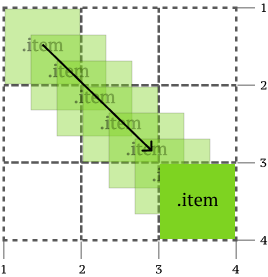
What is being animated is the grid row or column. That’s why we had that cool effect with the DevTools (it was cool to me, I don’t know about you…) but that also meant that you had to distort your grid to animate stuff within it.
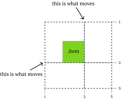
One of my favourite analogies to use when talking about how CSS grid is a game-changer for web layout is by comparing placement of grid items like placing pieces on a chessboard. So my next idea was to create a chessboard where the pieces could be animated across the board.
But I realised the challenge once I figured out how animation of grid items really worked. I couldn’t maintain a regular chessboard AND move chess pieces at the same time.
So you need to move some stuff around
If you’re expecting some really smart solution to this problem, I’m sorry to disappoint but my solution is the most un-smart of all. Each piece that needed to move was in its own grid, and all the grids were stacked on top of each other with positioning.
It’s all a scam, friends.
But it works, so there.
So Fool’s Mate is also known as the Two-Move Checkmate in chess. According to Wikipedia:
Fool’s Mate received its name because it can only occur if White commits an extraordinary blunder.
The opening move by White is f3, then Black responds with g4, then White goes g4 and Black does Qh4 and it’s all over. There are variations of this but I went with the default one on Wikipedia. And I chose Fool’s Mate to begin with because it only involved a total of 4 moves to animate. ¯\_(ツ)_/¯
Creating the chess board
Let’s talk about the chess board though, because I still kinda like how that turned out. I went with a board configuration where Black is on top and White is at the bottom. I’m guessing that most people would firstly think about creating 64 grid items for each square on the board.
But I wanted to get away with less markup. So instead of doing that, I only created 28 grid items to be my static chess pieces and instead applied a linear-gradient on the grid container to generate the requisite checkerboard pattern.
Also, there is emoji support for every chess piece. Emoji chess for me, thanks.
<div class="grid board">
  <div class="grid__item piece">♜</div>
  <div class="grid__item piece">♞</div>
  <div class="grid__item piece">♝</div>
  <div class="grid__item piece">♚</div>
  <div class="grid__item piece">♝</div>
  <div class="grid__item piece">♞</div>
  <div class="grid__item piece">♜</div>
  <div class="grid__item piece">♟</div>
  <div class="grid__item piece">♟</div>
  <div class="grid__item piece">♟</div>
  <div class="grid__item piece">♟</div>
  <div class="grid__item piece">♟</div>
  <div class="grid__item piece">♟</div>
  <div class="grid__item piece">♟</div>
  <div class="grid__item piece row7">♙</div>
  <div class="grid__item piece row7">♙</div>
  <div class="grid__item piece row7">♙</div>
  <div class="grid__item piece row7">♙</div>
  <div class="grid__item piece row7">♙</div>
  <div class="grid__item piece row7">♙</div>
  <div class="grid__item piece row8">♖</div>
  <div class="grid__item piece row8">♘</div>
  <div class="grid__item piece row8">♗</div>
  <div class="grid__item piece row8">♕</div>
  <div class="grid__item piece row8">♔</div>
  <div class="grid__item piece row8">♗</div>
  <div class="grid__item piece row8">♘</div>
  <div class="grid__item piece row8">♖</div>
</div>
As for the actual checkerboard, here’s how it was generated. Works pretty well, but the only thing is depending on the size of the viewport, you might see a very faint white diagonal gap across some of the darker coloured squares.
.board {
  background-color: #eee;
  background-image: linear-gradient(45deg, #d18b47 25%, transparent 25%, transparent 75%, #d18b47 75%, #d18b47),
  linear-gradient(45deg, #d18b47 25%, transparent 25%, transparent 75%, #d18b47 75%, #d18b47);
  background-size: 24vmin 24vmin;
  background-position: 0 0, 12vmin 12vmin;
  width: 96vmin;
  height: 96vmin;
  margin: auto;
}
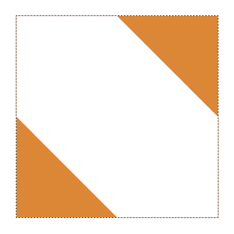
Let’s break down this block of CSS, shall we? Applying that linear gradient on a square <div> on its own gives you something like this. Because we are applying hard stops at a 45 degree angle. I’ve also declared 2 exactly the same linear gradients, but there’s a reason for that. You’ll see.
Next, we have the background-size property. Background properties I find a lot of fun because they usually have many different syntaxes. In this case, you can use keywords, a 1-value syntax, a 2-value syntax, multiple backgrounds (using commas) and global values. Fun, right?
One thing to remember is that ALL CSS properties that a browser supports will have a default value applied if you don’t explicitly declare it. The default value for background-repeat is repeat.
Anyhow, by setting the background size to a quarter of width and height of the main <div>, I end up with a 4 x 4 repeated pattern. You’d get the same effect by setting the value to 25% 25%.
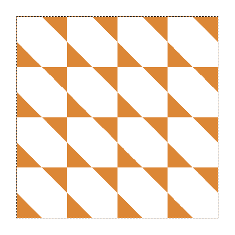
Maybe some of you can see where this is going, but the next step is to position the triangular shapes in a manner that they combine to form squares. background-position also does the 1-value or 2-value syntax thing. Here’s where the second linear gradient comes in.
background-position can be applied to multiple backgrounds by matching them up accordingly with commas. So the first set of values 0, 0 is for the first linear gradient, and the second set of value 12vmin 12vmin is for the second linear gradient.
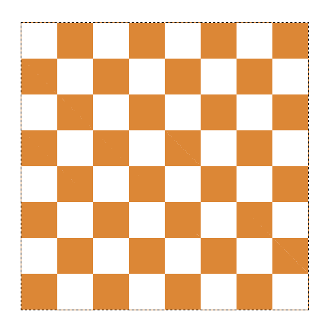
So what we are doing is pushing the second linear gradient down and right so the triangles meet up and form squares. For my example, I’m using the length value of 12vmin but you’d get the same effect by using 50% as well.
Placing the chess pieces
You might be wondering about my choice of CSS classes for the chess pieces. I had a previous experiment involving lots of grid items with gaps in between them and learned that you don’t necessarily have to explicitly place every grid item.
What I want here is to have the grid match up to the background of my grid container, and that’s why I chose to use viewport units instead of percentages. So my grid rows and columns look like this, where the values match up to the background size:
.board {
  display: grid;
  grid-template-columns: repeat(8, 12vmin);
  grid-template-rows: repeat(8, 12vmin);
}
Out of the 32 chess pieces, 28 are static. But I have to take into account gaps for the pieces that need to be animated.
.board .piece:nth-child(4) { grid-column: 5 }
.board .piece:nth-child(12) { grid-column: 6 }
.board .piece:nth-child(20) { grid-column: 8 }
.row7 { grid-row: 7 }
.row8 { grid-row: 8 }
Because of auto-placement, I can “push” the grid items forward by explicitly placing the King (4th child) on column 5, the pawn on f7 (12th child) on column 6 and the pawn on h2 (20th child) on column 8.
But all of White is at the bottom of the grid, so we have .row7 class to push all the White pawns onto row 7 and the .row8 class to push the White non-pawns onto row 8.
Animating the 4 moves
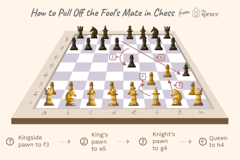
The moving pieces for Black are the Queen, which is on the first row, and the pawn at e7, which is on the second row. For White, the pieces are on rows 7 and 8 of my chessboard grid. And the moving pieces are the pawns at f2 and g2.
Remember the DVD demo? So each move will be a singular piece in its own grid. For example, this is the code for the Black Queen.
.move1 {
  grid-template-columns: 72vmin 1fr;
  grid-template-rows: 84vmin 1fr;
  transition: grid-template-rows 0.5s linear;
}

.move1.active {
  grid-template-rows: 72vmin 1fr;
}
I went with transitions instead of keyframes because my piece was just making 1 move. The DVD logo uses keyframes because it’s a continuous animation. Right tool for the right job, no?
There is Javascript involved here because I wanted to make it kind of sort of interactive where people can click on a button to move the next piece.
It’s only 4 moves, so I figured it wouldn’t be too hard. Needed a counter to track the start and end of the moves, but other than that, it was adding and removing CSS classes.
const prevBtn = document.getElementById('prev')
const nextBtn = document.getElementById('next')

let moves = 0

prevBtn.addEventListener('click', prevHandler, false)
nextBtn.addEventListener('click', nextHandler, false)

function nextHandler() {
  if (moves < 4) {
    countUp()
    addActive(moves)
    console.log(moves)
  } else {
    console.log('Already checkmate')
  }
}

function prevHandler() {
  if (moves > 0) {
    removeActive(moves)
    countDown()
    console.log(moves)
  } else {
    console.log('Back to the start')
  }
}

function addActive(moves) {
  const activeMove =  document.querySelector('.move' + moves)
  activeMove.classList.add('active')
}

function removeActive(moves) {
  const activeMove =  document.querySelector('.move' + moves)
  activeMove.classList.remove('active')
}

function countUp() {
  return moves++
}

function countDown() {
  return moves--
}
Wrapping up
Here’s the whole thing on CodePen if you want to see exactly how everything comes together.
See the Pen CSS Fool's Mate by Chen Hui Jing (@huijing) on CodePen.
If you found this interesting, maybe give it a try as well? I’m really curious to see what other things can be designed and built with this behaviour, so feel free to ping me with your creation. I also want to shout out Christopher Powroznik for creating the One HTML Page Challenge.
I’ve put up this Fool’s Mate demo on there, but there’s so much more that can be done in 1 single page. It’s pretty fun to build stuff without external dependencies for a change.