At the end of 2016, I published a website called Penang Hokkien 槟城福建话. Just a few months prior, I had started playing around with the CSS writing-mode property after having a random thought on my daily bicycle commute to work. That grew into a really long blog post on Chinese typography on the web, and an experimental layout-switching demo. During that period, I also discovered the Penang Hokkien Podcast.
Penang Hokkien is a variant of the Hokkien dialect that is unique to the northern states of Malaysia, and is essentially the lingua franca of Penang. It is also my mother tongue, and the main language spoken within my household. Penang Hokkien holds a special place in my heart. It represents where I come, where I belong, it is the language of home.
Given that building websites is one of those things that I’m sort of decent at, I figured I’d build a website dedicated to Penang Hokkien, specifically, stories about the unique usage of certain words and phrases that aren’t used elsewhere. And because I also LOVE playing with CSS, it was an excuse to extend my earlier writing-mode demo into a fully-fledged website.
Some logistical decisions
All my previous demos and random side-projects were hosted on GitHub as project pages tied to my user account. I’m too cheap to buy additional domain names, so all of them are subsites of www.chenhuijing.com 🤷. But I really wanted this site to stand alone.
Sometime last year, I learned that GitLab had GitLab Pages and always wanted to try it out, but never had a compelling reason to. Until now. It wasn’t the smoothest experience (largely due to my own ineptitude), but it wasn’t terrible either. And I kinda like GitLab to begin with anyway. I wrote about the experience as well.
Flexing the brain muscles
Content creation is not easy. If you find it easy, well, good for you then. I tend to write English more often, simply because English is the main language used in my industry. I use Chinese mostly when speaking, or messaging my friends. And I speak Hokkien with family or go back to Penang.
Even though I’m lucky enough to have learnt English and Chinese reasonably well, I sometimes still fall into the trap of direct translation. It depends on whether I’m thinking in English or Chinese at the time. Most of the time, I’ll catch these when I do a second read-through. In fact, the best thing to do (at least for me) is to do the editing after taking a nap. 🙃
There are also times when you find there is no good English equivalent for a certain Chinese phrase or vice versa. Those are the times that make my brain hurt. And because I made the ridiculous decision to record a Penang Hokkien version of each story, there’s a second round to translation to be done. So content creation for this site was quite the workout for the linguistic part of my brain.
Some of the fun stuff
I wanted the site to be fully-responsive and cross-browser compatible. It definitely does NOT have to look the same in every browser but there shouldn’t be situations where broken layouts compromise content consumption. I want to yet again shout-out Browsersync which made testing so much easier.
Switchy-switchy
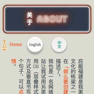
In my first writing-mode demo, I had a checkbox that toggled between horizontal and vertical writing modes. In that case, it was the same block of content, displayed differently (via a CSS class).
This site utilised a similar concept, in that there would be a toggle, but this time it’d be to switch between 2 blocks of content. The same technique used for pure CSS tabs, just that the “tabs” would be styled to look like buttons.
<section class="c-intro">
<input type="radio" name="language" id="lang-en" class="l-toggle__en" />
<label for="lang-en">
<span class="lang-toggle__en">English</span>
</label>
<input type="radio" name="language" id="lang-zh" class="l-toggle__zh" checked="checked" />
<label for="lang-zh">
<span class="lang-toggle__zh" lang="zh">中文</span>
</label>
<div class="l-lang__en c-lang__en">
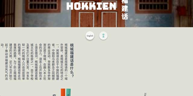
<h2>What is Penang Hokkien?</h2>
<p>Penang Hokkien is a variant of the Hokkien dialect that is unique to Penang, Malaysia. Hokkien originated from the southern Fujian province in the Minnan region of China. As the Chinese settlers integrated themselves into the local community, they started incorporating indigenous words into their language. Penang Hokkien is an integral part of our cultural heritage and there has been a movement to rejuvenate interest and prevent the language from dying out.</p>
</div>
<div class="l-lang__zh c-lang__zh" lang="zh">
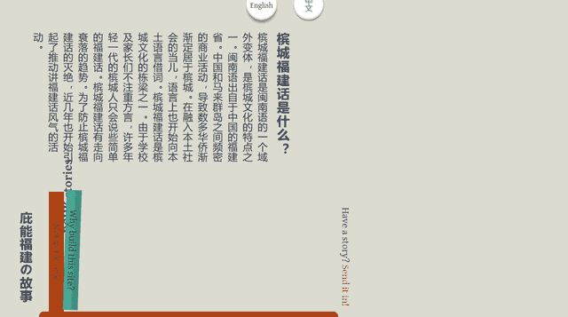
<h2>槟城福建话是什么?</h2>
<p>槟城福建话是闽南语的一个域外变体,是槟城文化的特点之一。闽南语出自于中国的福建省。中国和马来群岛之间频密的商业活动,导致数多华侨渐渐定居于槟城。在融入本土社会的当儿,语言上也开始向本土语言借词。槟城福建话是槟城文化的栋梁之一。由于学校及家长们不注重方言,许多年轻一代的槟城人只会说些简单的福建话。槟城福建话有走向衰落的趋势。为了防止槟城福建话的灭绝,近几年也开始引起了推动讲福建话风气的活动。</p>
</div>
</section>The writing-mode property was applied to the Chinese content wrapper.
.l-lang__zh {
  text-align: justify;
  writing-mode: vertical-rl;
  max-height: 13em;
  overflow-x: auto;
}
The trickiest part about having mixed writing-modes is centring content. I’m guessing mixed writing-modes is not a common use case and the behaviour is pretty inconsistent across browsers. My primary development environment is Chrome on Mac OS, and things tend to render nicely in this environment. So if you play around with experimental features, be sure to check other browsers frequently.
I ❤️ neon lights
For the About page, I applied the writing-mode: vertical-rl property to the entire <main> element instead, then modified individual bits to display horizontally where needed. And here I saw an opportunity to put in some CSS fanciness for the page title.
I first learned about Chromatic Fonts on the web back in March 2016 from Roel Nieskens when he published Building Bixa Color, a color font for the web. And some time later, he pointed me to Bungee, another multi-colour font. What’s special about Bungee is that it is also optimised for vertical typography.
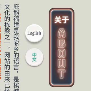
Vertical neon signs are a pretty common sight in urban areas which are predominantly Chinese and I wanted that effect, with CSS! Here’s where the text-shadow property comes in handy, perfect for that glowing effect. Bungee comes with font-feature-settings that kern it vertically, but you have to explicitly set them via CSS.
.c-title {
    background: #313b4a;
    color: #fff;
    border-radius: .5em;
    border: 1px solid #fff;
    box-shadow: inset 0 0 10px #fff, 0 0 5px #fff, 0 0 10px #fff, 0 0 15px #f04c16, 0 0 20px #f04c16, 0 0 0 0.35em #313b4a;
}

.c-title__en {
    font-family: "Bungee Outline";
    text-shadow: 0 0 5px #fff, 0 0 10px #fff, 0 0 15px #fff, 0 0 20px #f04c16, 0 0 35px #f04c16, 0 0 40px #f04c16, 0 0 50px #f04c16, 0 0 75px #f04c16;
    text-orientation: upright;
    font-feature-settings: "vkrn", "vpal";
}
There’s a lot more code than what I show here, largely because I switch back to a horizontal layout on narrower screens. But this is the gist of the neon lights effect.
Fancy form input
I also had the brilliant idea to have a newsletter subscription box, because why not? Actually I always wanted to try out TinyLetter but never had an use case for it. As an avid reader of Codrops, I’m a big fan of Manoela Ilic AKA Mary Lou, who creates all sorts of wonderful CSS effects and shares them with us. I borrowed one of hers for this.
One thing I had to get around was that the label of the input field used a little bit of Javascript to trigger a CSS class that transformed it when the field was focused. In the event that Javascript failed for whatever reason, the field would have default styling that did not require CSS transforms. At first I tried using Modernizer, but then realised this was the perfect scenario for a feature query.
I had only ever deployed 1 feature query before to detect vmax and it worked beautifully. So this time, my feature query to detect CSS 3D transforms looked like this:
@supports (transform: translate3d(0,0,0)) or (-webkit-transform: translate3d(0,0,0)) {
  /* relevant CSS here */
}
If you’ve never heard of feature queries before, you definitely must read Jen Simmons’ post Using Feature Queries in CSS.
Javascript-less modal
A last minute edition was a contact form. Some people are going to be horrified that I didn’t plan the content of the site out before actually designing and building the thing. But I found it easier (and much faster) to just design and tweak as I built 🤷.
It occurred to me that I ought to include some sort of contact information somewhere on the site, and I really didn’t have a good place to chuck this form. So I decided to make it a modal, which was triggered when someone clicked on the envelope icon in the footer. Could I have put in somewhere more obvious? Sure, if I had thought this through, but I didn’t. 💩 happens.
I found out about the :target trick from Heydon Pickering’s post on Reimagining Single-Page Applications With Progressive Enhancement and thought it’d be cool to build a CSS-only modal with it.
.c-contact {
  background: rgba(0, 0, 0, 0.7);
  transition: opacity 500ms;
  visibility: hidden;
  opacity: 0;

  &:target {
    visibility: visible;
    opacity: 1;
  }
}
In short, :target is a pseudo-selector which is activated when the id of an element matches the hash in the URL. So I gave the links that were supposed to trigger the modal an href of #contact and they triggered the styles that made my contact form element visible. Also, I’m using Formspree to handle the submissions, this being a static site and all.
OMG so many bugs 😭
SO. MANY. CROSS-BROWSER. BUGS. 🐞
Browser behaviour is super inconsistent for mixing writing-modes, especially in terms of overall page layout. Chrome, Safari and Opera on Mac OS all seemed to behave reasonably well. On Firefox, writing-mode doesn’t play well with display: flex and I think Firefox doesn’t handle child elements with a different writing-mode from its parent the same way as the other 3 browsers. And don’t get me started on the Microsoft browsers.
I could not for the life of me get my block of Chinese content centred properly on Firefox or Edge/IE.
I managed to find a fix for the issue on Firefox but I don’t really understand exactly why it works. Adding a margin-left then transforming it back centred the block. If you know why this works, please let me know.
.l-lang__zh {
  margin-left: 50%;
  transform: translateX(-50%);
}
MS browsers also seem to have issues with rotation via CSS transform when the element has a vertical writing-mode. The transform-origin seems out of whack. Plus, the margin/transform trick for Firefox does NOT work for MS browsers.
I had to work-around the problem using BrowserHacks. I know it’s not a best practice, but I don’t think feature detection works here, because technically MS browsers DO support writing-modes, just not well I guess. If you peek into my source code (available on GitLab), you’ll see the hacks in all their gory glory.
@media screen and (-ms-high-contrast: active), (-ms-high-contrast: none) {
  /* Styles specific to IE10 and IE11 */
}

@supports (-ms-ime-align:auto) {
  /* Styles specific to Edge */
}
The flexbox problem reared its ugly head on the About page, and turns out this is a known browser bug. So I decided to have a different layout just for Firefox that circumvents this issue altogether. But I’ll definitely be tracking the progress of these bugs.
- Bug 1189131 - flex align-items center displaces text when writing-mode is vertical-rl
- Bug 1223180 - Flex + vertical writing-mode: flex items / text disappear
- Bug 1267462 - Use logical dimensions/coordinates more in flex layout
_:-moz-tree-row(hover), .RELEVANT_SELECTOR {
  /* Styles specific to Firefox */
}
Even though it took me 4 days to build and launch the site from scratch, it took me way longer than that to address the various cross-browser bugs. As of time of writing, there’s still a bug in Chrome on OpenSUSE that I haven’t investigated yet.
Wrapping up
It had been a while since I built something for myself, so this was a fun project, albeit frustrating when I started testing across the different browsers. But that’s precisely why we need to start trying out some of the lesser used CSS properties in actual projects, so we can help find odd browser behaviour and raise them as bugs to be fixed.