I have a habit of saying yes to requests before I realise I have never done said request before. I acknowledge that this is not an optimal strategy to adopt, and some day I’ll get in trouble for this, but this post is about a time when things went right (well, let’s just say nothing burned down). A close friend of mine makes customised cakes and needed a website, so I figured I’d build her one.

All I had to start with, was 128 pictures of cakes and confectioneries. This made things really interesting. The good part about this project was that my friend was a great client. She trusted me to do my job well, and was always available to answer any questions I had about her business.
Understanding the business
The first thing I did was to just sit down and talk with her so I could really understand how her business worked. We covered typical questions like what products she offers, how much everything cost and so on. She walked me through how a typical order took place from start to delivery. I asked about the business itself, why she set it up in the first place, and how she felt about the business, so we could establish a suitable design direction. This also helped me with copy-writing for the site.
Key takeaways were:
- A majority of her customers would approach her with some theme in mind already
- Cakes were customised to fit her customers' specific needs
- Other than word-of-mouth referrals, new customers approached her after seeing photos of cakes she made
- She offered a fixed set of flavours and sizes
- There is no physical store-front
- There is no delivery service and customers would meet at designated pick-up locations
- There were a number of questions that almost all customers would ask
- There was a standard set of information she would need from her customers
- About half her customers were pre-dominantly Chinese-speaking
Site architecture and content
The site would be built on Drupal (unsurprising, I know) and have multi-lingual functionality (just English and Chinese, really). I’d done a number of multi-lingual setups by now so I was fully aware of how well Drupal handled multi-language (ergo, how easy my life would be).
It wouldn't be a complicated affair. Prospective customers who landed on the site could:
- view pretty pictures of delicious cakes
- find out how to order one
- actually place an order and, if they're interested
- learn more about the baker behind the goods
Given that most customers had similar questions, I thought it made sense to have the answers to those questions laid out clearly on the site in the How to order page. Contact options were made easily accessible so visitors didn’t have to hunt for a way to contact the store.
Visual design
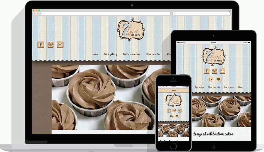
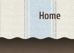
The bakery was essentially a one-woman operation, and cakes were made to order and delivered immediately after they were baked. Given the personalised nature of her products, I went with a warm and friendly colour palette. I wanted the site to feel welcoming, like you could almost smell the freshly baked cakes. The site’s design was thus inspired by the look of small bakery store-fronts, the kind with canvas awnings above their store windows.
My go-to resource for textures is Subtle Patterns. Their name is self-explanatory. All the textures are free and you get both the normal and 2x versions in your download.


Continuing with the theme of old-school bakery, I decided on using wood textures for all the buttons and icons.

I was never formally trained in design school, so the idea of creating static mock-ups in Photoshop was, to me, a tiresome affair. By now, I had created quite a number of custom responsive themes from my starter-kit so I was able to set it up quickly and make all my design decisions from the browser itself. I’d like to take the time to show my appreciation for the fact that CSS can now do so many things and that devtools exist.
Site building
When I say multi-language Drupal, you say i18n. I cannot say enough about the robustness of Drupal’s multi-language support and the fact that Drupal 8 is making it even better just brings a smile to my face.
One another thing I tried out with this site was Isotope for filtering of images. Turns out, there’s already a module for that called Views isotope. The integration with Views is pretty smooth and didn’t take too long set up.
I also took some extra time on the contact form. I didn’t want a twenty-field form that would turn customers off, but I still wanted to capture the information my friend required and streamline some of the communication between them. The logical solution to this problem would be conditional fields, where customers would only see and fill in the fields relevant to the type of cake they wanted.
Hosting and server set-up
My personal domain was registered through NameSilo and I never had any bad experiences with them, so I registered the domain name 7lovebakery.com with NameSilo as well. But web hosting was something I really had to think through.
As a developer, I wanted to have full access to the server, and freedom to install whatever I needed (Git and Drush) without having to go through the technical team of the hosting company. After exploring a number of shared hosting services, I realised the best way to go was to have a dedicated server. But as a small business, my friend didn’t have a big budget for this. I settled with using DigitalOcean and I must say, that was a good decision.
Even though I’d never set up my own server before, the documentation is absolutely fantastic. DigitalOcean’s tutorials are extremely well-written and easy to follow (trust me, if someone like me can get it, anyone can). I admittedly nuked my first server because I messed it up, but how many people get it right the first time? And because it’s so easy to start over (not to mention dirt cheap), it doesn’t matter if you get it wrong the first time. For anyone who’s interested in learning how to set up a web server, I strongly recommending doing all your experimentation on DigitalOcean.
If a larger budget was available, I’d actually go for a dedicated Drupal hosting platform like Pantheon or Acquia because they handle Drupal updates for you. I’ve had some experience with Acquia Cloud Enterprise and I must say, the response time is pretty quick. Definitely something to keep in mind for clients who can afford it.
Site optimisations and performance
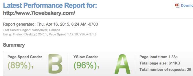
Aside the from basic site optimisations I do for every Drupal site I deploy, I also made use of Cloudflare to speed it up. In this day and age, we can’t have resource heavy sites clogging up our browser experience. All images used were run through Drupal’s own image processor. I find it useful to run the site through performance tests just to check if there are any optimisations that I missed out.


Wrap-up
I’m really fond of this project because I learnt so much from it, from visual design to server set-up. I may not be the best sysadmin or visual designer, but having gone through the process, I’ve learnt to appreciate these roles even more.