My next assignment was actually with the very first client I ever worked with. Repeat client! This time, the task was to revamp two key sections of the website. If you read my previous account of the first project, you may remember that this site was a direct port from HTML. There wasn’t much design input on our part then, as the objective was to get the site up and functioning. Now that everything was working properly, it was time to implement some design improvements.
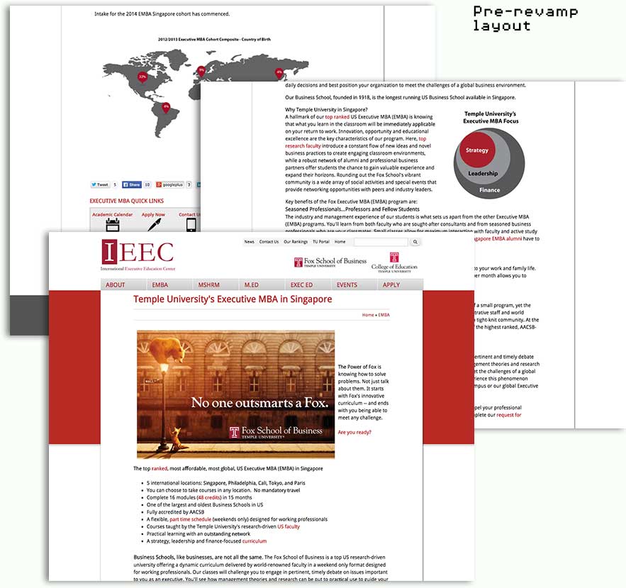
When the first iteration of the site was built, all the sections of the site were simply basic pages. All the content was input with the WYSIWYG editor in the body field. A lot of the value proposition was lost in the long block of text. There were no obvious call-to-actions and key information was buried somewhere down the page or only accessible via links within the text.
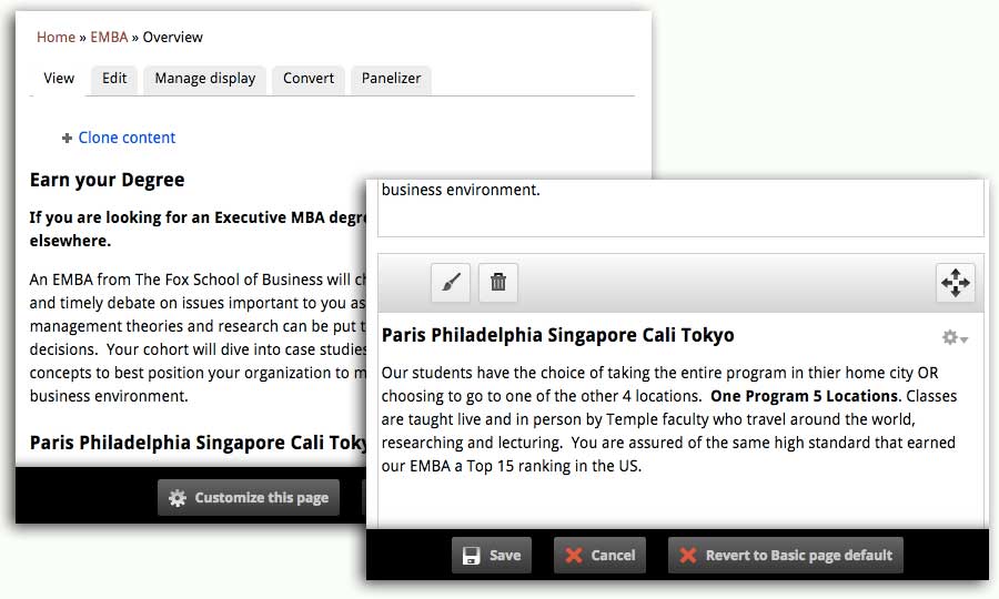
With only a single body field to work with, content editors were nervous about editing because they were concerned that they would mess up the layout. Most content editors were not very familiar with HTML and relied heavily on the WYSIWYG toolbar to format the long block of content. In an ideal world, I would choose not to include a WYSIWYG editor at all, and let the content editors just focus on content, however, I do realise that the WYSIWYG editor is a “necessary evil” most of the time.
Editing HTML could be intimidating for the uninitiated, and the odds of messing something up increases the more content there is. Drag-and-drop for small blocks of content was a more friendly user-interface. Luckily, there’s a module for that. With Panelizer, I was able to setup the page such that users could create blocks of content which they could then drag-and-drop.
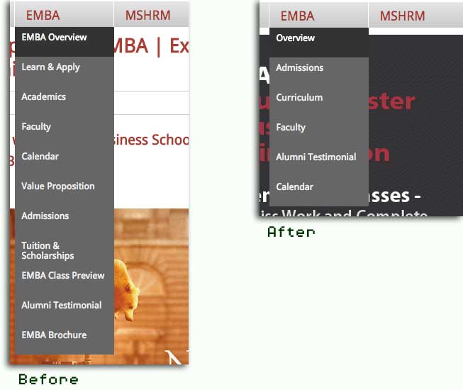
Aside from that, we did some minor clean-up of the site architecture for the EMBA and MSHRM sections. Some sections contained similar information and we chose to merge those sections, making it clearer where specific information could be found.
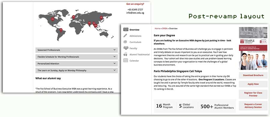
There was also some information that we felt would be better presented as through an accordion interface. This led me to explore a number of Drupal modules that provided accordion functionality, but I just couldn’t find one that fit our requirements nicely. I decided, maybe it’d be easier to write my own accordion.
At this point in time, I had a fair number of projects under my belt. However, I still never really got the hang of jQuery. As someone without any background in programming, Javascript just seemed kind of daunting. HTML and CSS was pretty easy to pick up, but Javascript and jQuery just seemed…hard.
The first jQuery learning resource I tried was Try jQuery by Code School. It was very good, and took me through all the basics of jQuery but somehow it didn’t stick. In retrospect, I realised that I needed to use what I learned on an actual project before I could really wrap my head around it. This was a good opportunity for me to finally understand this jQuery thing. This post covers my adventures in accordion creation.
The layout was redesigned so call-to-actions were clearly displayed in a sidebar on the right. We also added secondary navigation links on a left sidebar so users could navigate the section more easily.
Working on a website one year later is quite an introspective experience. There were so many things I learnt in that span of time that I refactored some of my code to reflect my new knowledge. I’m pretty sure if I worked on this site again in the future, there would definitely be another round of refactoring, but that’s just how it is, isn’t it?
By continuously improving the design of code, we make it easier and easier to work with. This is in sharp contrast to what typically happens: little refactoring and a great deal of attention paid to expediently adding new features. If you get into the hygienic habit of refactoring continuously, you’ll find that it is easier to extend and maintain code.
― Joshua Kerievsky, Refactoring to Patterns