It’s time for my annual Drupal project again. I had actually got my start in web development with Drupal and although I’ve left agency life, it seems that I’d still end up with at least one Drupal project a year. Largely because when someone needs a CMS, I tend to lean toward Drupal, it’s like Linus and his blanket 🤷.

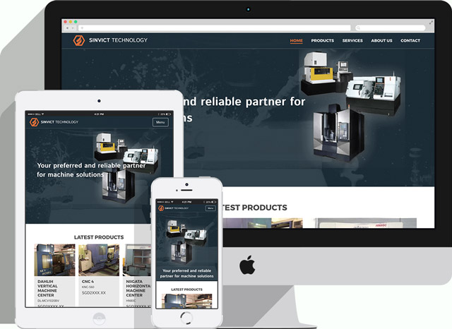
Sinvict Technology is a company that manufactures CNC (Computer Numerical Control) machinery, as well as repairs and servicing for those machines. With their main client base in the South-east Asia region, one of their key concerns was to have their website be performant on dodgy network connections, as their existing site was around 11mb and took 1 minute to load. (I know this because I checked it, to prove a point 😈)
The site requirements were not overly complicated and I was also working with a designer I was familiar with, so things were a little smoother than if it was a complete stranger. Sinvict did not have an IT department, nor a dedicated staff member to be in charge of the website. Given such circumstances, I decided to host them on Pantheon, and then proceeded to write a blog post about it.
General requirements
- Website performance score should be at least 75 and above
- Responsive site that works well on mobile
- Custom designed theme (provided by in-house designer)
- Non-technical users can add and update content
These requirements were reasonable enough, and I’d worked on enough projects to understand that a website will LOOK 80% complete in 20% of the time, but the devil is in the details, and that is what takes up the bulk of the effort.
Building a website is a lot like creating a sculpture, where you start off with a heavy chisel cutting off large chunks of stone, then move on to a point chisel to actually carve out the details of the sculpture.
It all starts off with a basic installation of Drupal 8, plus some developer modules like Admin Toolbar, Devel and Browsersync. Views is part of core now, and honestly, I’ve never built a Drupal site without Views before, so I’m pretty happy about this for Drupal 8.
Module selection
I had already gone through two meetings with the key stakeholder and designer for the site and we had agreed on what functionality would be available on the site. Next, was to decide which modules would work best to achieve those features.
Based on the proposed design, using Panels to build out the pages seemed like the best approach, as there were numerous views of the same content type, each with different filtering criteria, that would appear on the various sections of the site. Panels allowed me to build out the site using blocks of content, kind of like piecing together a Lego house.
Panels is slightly different in Drupal 8 than Drupal 7. Because the interface is slightly different now, it took me quite a while before realising I could do use an existing node as a block by selecting Entity View (Content) from the Chaos Tools section when adding a new block. Custom block management is much sleeker now in Drupal 8 as well, and custom blocks replaced what I used to do with custom content panes in Drupal 7.
Display Suite remains an indispensable module, especially if the site you’re building requires a custom theme, because DS lets you get really granular with how you want fields to be displayed. Field Group is helpful for custom layouts because sometimes certain fields need an extra wrapper around them for styling purposes.
Although Views is part of core, it seems Better Exposed Filters wasn’t folded in there, and I’m sure there are pretty good reasons for that. But BEF is really helpful when you want to create filters that can be modified based on user input, and I’m quite thankful they managed to port this over to Drupal 8.
This site, being a kind of brochure site for second-hand CDC machines, ultimately needed some way to display all the images of the machines. So an image gallery was needed. The Flex Slider library was the closest fit to the design’s requirements, and luckily there was already a Drupal module for that.
Custom theme work
Now, this is my bread and butter. So, because of this project, I ported my original starter base theme, Clarus, from Drupal 7 to Drupal 8, and took the opportunity to do some housekeeping, like removing unused dependencies and updating the gulpfile.js and so on.
A major change from Drupal 7 to Drupal 8 is the use of Twig as the templating language over PHPTemplate, so no more .tpl.php files. Instead, we have .html.twig files. The syntax of Twig is quite similar to Liquid, if you’ve ever used Jekyll before, this should ring a few bells for you.
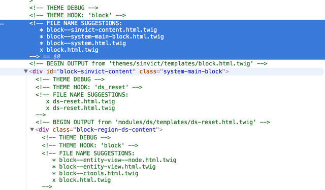
A really helpful developer tweak is the ability to turn on debug mode, which adds comments when you inspect through DevTools that indicate which template suggestions work best for the specific section you’re trying to customise.

Drupal 8 has pretty much has a revamped file and folder structure, so custom themes now go into the /themes folder, which to me, is much more intuitive. All the core files can be found in the /core folder, default themes and modules included.
The way to utilise external libraries is also different now, making use of a .libraries.yml file instead. We now declare the external resources, be it Javascript or CSS, and include them only on pages that need them by declaring them in the appropriate template file.
We put in some little animations to spruce things up a bit, with this particular flip-effect utilising 3D CSS transforms, and for browsers that don’t support it, and narrow screen sizes, it falls back to a simple opacity fade.
There was also liberal use of viewport units throughout the entire theme. The quote marks on the About page are pseudo-elements placed behind the quote text, and they adjust themselves because, you know, media queries. And if you play the short video below, you’ll notice use of the picture element where two different iamges are used for the banner depending on the screen width.
Page performance
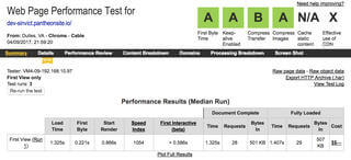
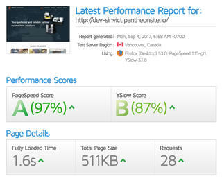
So one of the requirements was to NOT have the page be like 11mb and take 1 minute to load, which honestly is a really, really low bar. There are further optimisations possible because as of point of writing, we haven’t moved to Pantheon’s production server (this is still the development server), but you can see it loads under 2 seconds and weighs in at under 1mb, which I think is pretty decent.


Wrapping up
It was great to have the chance to flex my partly-atrophied Drupal muscles again and to familiarise myself with Drupal 8, which was something on my radar for the past 2 years that I never really got around to doing seriously. Also wonderful to work with clients that I have a good working relationship with because it made things go a lot smoother. Until the next one!