I talk about the web. I talk about the web a lot. But sometimes, we need stuff made in the physical world. Sometimes, we need a banner. Banners can be designed more ways than Sunday, but usually, your friendly neighbourhood printer will ask for some sort of digital file. Maybe an SVG or a high-resolution PNG, even PDF.
Whatever the format, the key to a decent print banner is the resolution of the file. Even though the end result is largely dependent on the materials use to produce the banner, a high resolution base image would definitely help the cause.
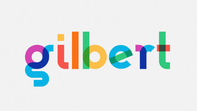
The thing is, I came across this font called Gilbert, and instantly fell in love with it. It is a colour font, created to honour the memory of Gilbert Baker, LGBTQ activist and artist, creator of the iconic Rainbow Flag.
Using colour fonts in general
In 2017, there was no CSSConf.Asia (neither will there be on in 2019, unfortunately). So Chris and I somehow came up with this hare-brained idea to have a mini half-day conference style CSS event. I called it the Talk.CSS max-content edition, because you know, maximum content? Look, naming things is hard.
I thought it was the perfect opportunity to use Gilbert for the text max-content. Subtly colourful was what I was going for. Things went well on the website itself. The way colour fonts work, even if the browser doesn’t support colour fonts, the typeface still renders and displays, just solid black instead of in colour.
Gilbert’s colour font version came in OpenType (.otf), so it wasn’t hard to style the words max-content to use it. I then wanted to create banner images for the social medias and realised that I couldn’t. My broke ass clearly did not own a single Adobe product, and at the time (before 23 Jan 2018), Photoshop and maybe Illustrator were the only applications that supported colour fonts.
Note: the situation is much better now with at least 7 applications that support OpenType-SVG fonts. For more information, check out colorfonts.wtf
Using the colour font for social media images
I only had Sketch on my computer, and that was a no-go. But I also realised I was using a retina display, and hence could take relatively high resolution screenshots. I also really liked doing all kinds of stuff with CSS. A modern browser and some CSS is just as good as Photoshop for my purposes.
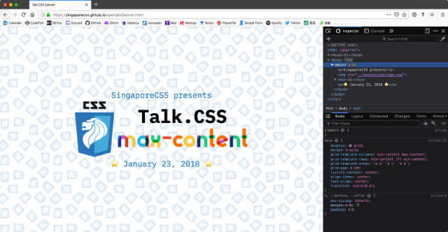
So the first pass of using the browser as a screenshot generator was for banner images to use with Twitter and Facebook. Layout was naturally done with CSS grid. And the setup wasn’t too complicated, looks something like this:
<main>
  <p>SingaporeCSS presents</p>
  <img src="../assets/img/logo.svg">
  <div>
    <h1>Talk.CSS</h1>
    <code>max-content</code>
  </div>
  <p>⭐️ January 23, 2018 ⭐️</p>
</main>
I kept everything on 1 single index.html, which meant the styles were within a <style> tag in the <head>. There weren’t that many styles anyway. But the plus of using CSS for layout is, well, you know, access to the box alignment properties, Flexbox and Grid, viewport units and all that delicious good stuff.
html {
  box-sizing: border-box;
}

*,
*::before,
*::after {
  box-sizing: inherit;
  margin: 0;
  padding: 0;
}

body {
  height: 100vh;
  background-image: url('../assets/img/tile.png');
  background-repeat: repeat;
  background-size: 12em;
  display: flex;
}

main {
  display: grid;
  margin: auto;
  grid-template-columns: min-content max-content;
  grid-template-rows: min-content 1fr min-content;
  grid-template-areas: 'a a'
                        'b c'
                        'd d';
  grid-gap: 1em;
  justify-content: center;
  align-items: center;
  text-align: center;
  transform: scale(0.6);
}

p {
  font-family: 'iA Writer Duospace';
  font-size: 3em;
  line-height: 1;
  color: #1572b6;
}

p:first-child {
  grid-area: a;
}

p:last-child {
  grid-area: d;
}

img {
  margin: auto;
  height: 45vh;
  grid-area: b;
}

div {
  grid-area: c;
}

h1 {
  font-family: 'iA Writer Duospace';
  font-size: 7em;
  line-height: 1;
}

code {
  font-family: 'Gilbert Color';
  font-size: 10em;
  line-height: 1;
}
Grid template areas are my preferred technique of choice for such things, because I’m too lazy to keep track of row and column numbers. Also, because I already had all the needed fonts installed locally on my computer, I didn’t even bother with fallback fonts.
I think if you manage to find the file on the interwebs, unless you have iA Writer Duospace and Gilbert Colour both installed on your machine, it’s not going to look that pretty. But the file(s) are for my own use anyway, so I don’t really care… 🤪
Most of the adjustments could be made on the fly directly from DevTools itself as well, so it wasn’t all that hard to get a number of different sizes for the different social medias.
Using the colour font for pull-up banners
We managed to get an anonymous angel donor, and so had the budget to get 2 pull-up banners printed. There was a standard sizing, I can’t really remember the exact numbers. But the width to height ratio was something like 600mm × 1700mm.
Anyway, I was wondering how to the get the resolution higher than that of my 2560 × 1600 screen when I realised, there’s nothing restricting me from setting sizes larger than 100vw.
html {
  box-sizing: border-box;
}

*,
*::before,
*::after {
  box-sizing: inherit;
  margin: 0;
  padding: 0;
}

body {
  height: 425vw;
  width: 150vw;
  background-image: url('../assets/img/tile.png');
  background-repeat: repeat;
  background-size: 40vw;
  display: flex;
  text-align: center;
}

main {
  width: 100%;
}

img {
  height: 95vh;
}

h1 {
  font-family: 'iA Writer Duospace';
  font-size: 20vw;
  line-height: 1;
  margin-bottom: 0.25em;
  padding-top: 45%;
}

code {
  display: block;
  font-family: 'Gilbert Color';
  font-size: 24vw;
  line-height: 1;
  margin-bottom: 0.75em;
}

h2 {
  font-family: 'iA Writer Duospace';
  font-size: 10vw;
}
All the assets were either SVG images or text, which could also be sized with viewport units. So I blew up the whole thing to be 150vw × 425vw and adjusted all the images and text sizes until it looked decent. Yes, I eye-balled the design, sue me.
The best part is that Firefox has a built-in screenshot tool which could export the full page and not just the visible areas, so I ended up with a file that was 2160px × 6120px and could probably do more adjustments if necessary.
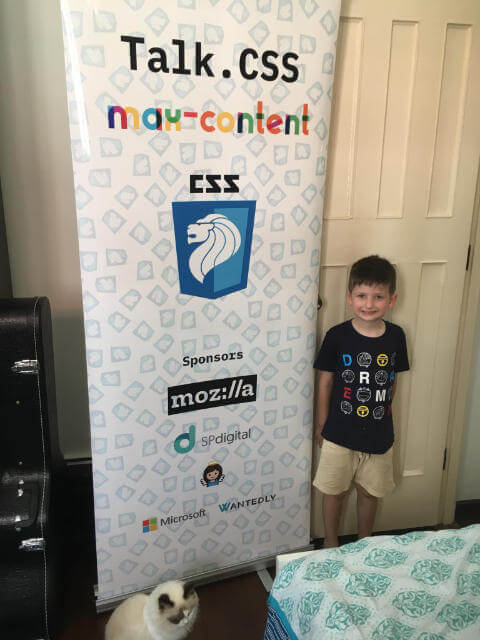
End result
To our surprise, and we at SingaporeCSS are known for having very little expectations in general, the end result was pretty decent. Considering we hadn’t planned on even having these banners in the first place, and went for the most budget option we could find, this is an A-plus result!
It’s only apt that the CSS meetup uses CSS to generate all the things. But remember, viewport units are not limited to the viewport alone.
CSS all the things!
(Or maybe not…you do you)