The web is not just left-to-right

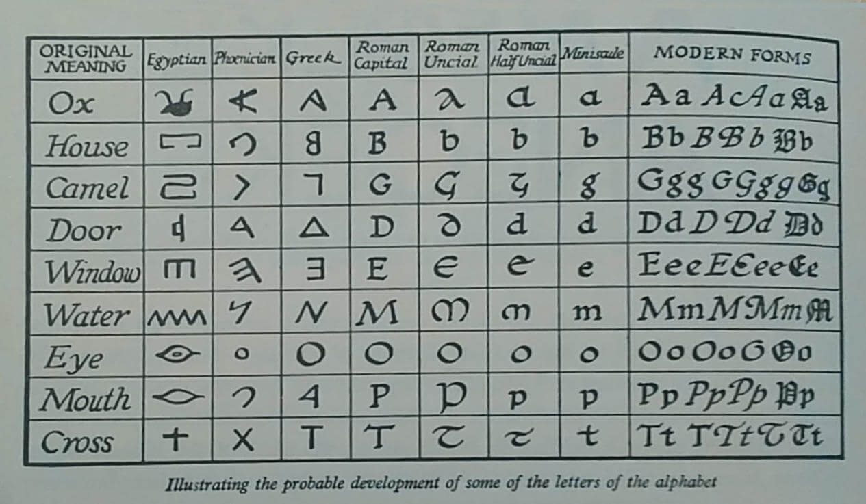
What is typography?
“Typography is writing with prefabricated letters”
—Gerrit Noordzij
| ا | ب | ج | د | ه | و |
| ز | ح | ط | ي | ك | ل |
| م | ن | س | ع | ف | ص |
| ق | ر | ش | ت | ث | خ |
| ذ | ض | ظ | غ | Arabic (28) | |
| А а | Б б | В в | Г г | Ґ ґ | Д д |
| Е е | Є є | Ж ж | З з | И и | І і |
| Ї ї | Й й | К к | Л л | М м | Н н |
| О о | П п | Р р | С с | Т т | У у |
| Ф ф | Х х | Ц ц | Ч ч | Ш ш | Щ щ |
| Ь ь | Ю ю | Я я | Ukranian (33) | ||
| א | ב | ג | ד | ה | ו |
| ז | ח | ט | י | ך כ | ל |
| ם מ | ן נ | ס | ע | ף פ | ץ צ |
| ק | ר | ש | ת | Hebrew (22) | |
| A a | B b | C c | D d | E e | F f |
| G g | H h | I i | J j | K k | L l |
| M m | N n | O o | P p | Q q | R r |
| S s |
T t | U u | V v | W w | X x |
| Y y | Z z | English (26) | |||
Source Hans Serif Regular (65,535 glyphs)
Communication
(English) 13 letters
沟通
Backpfeifengesicht
(German) 18 letters
欠扁
Grianghrafadóireachta
(Irish) 21 letters
摄影
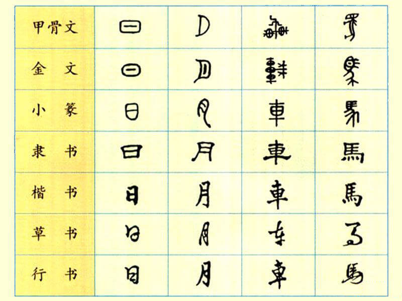
Phoenician alphabet
甲骨文


“Chinese-script projects are crazy. The scope is mind-blowing.”
—David Březina from The long, incredibly tortuous, and fascinating process of creating a Chinese font
The web is a unique medium of its own

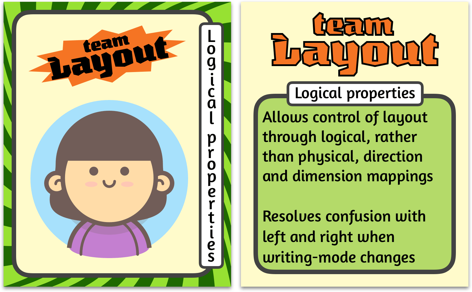
Team layout

And more...
三十八年后。
汪淼觉得,来找他的这四个人是一个奇怪的组合:两名警察和两名军人,如果那两个军人是武警还算正常,但这是两名陆军军官。
汪淼第一眼就对来找他的警察没有好感。其实那名穿警服的年轻人还行,举止很有礼貌,但那位便衣就让人讨厌了。这人长得五大三粗,一脸横肉,穿着件脏兮兮的皮夹克,浑身烟味,说话粗声大嗓,是最令汪淼反感的那类人。
「汪淼?」那人问,直呼其名令汪淼很不舒服,况且那人同时还在点烟,头都不抬一下。不等汪淼回答,他就向旁边那位年轻人示意了一下,后者向汪淼出示了警官证,他点完烟后就直接向屋里闯。
「请不要在我家里抽烟。」汪淼拦住了他。
「哦,对不起,汪教授。这是我们史强队长。」年轻警官微笑着说,同时对姓史的使了个眼色。
「成,那就在楼道里说吧。」史强说着,深深地吸了一大口,手中的烟几乎燃下去一半,之后竟不见吐出烟来。
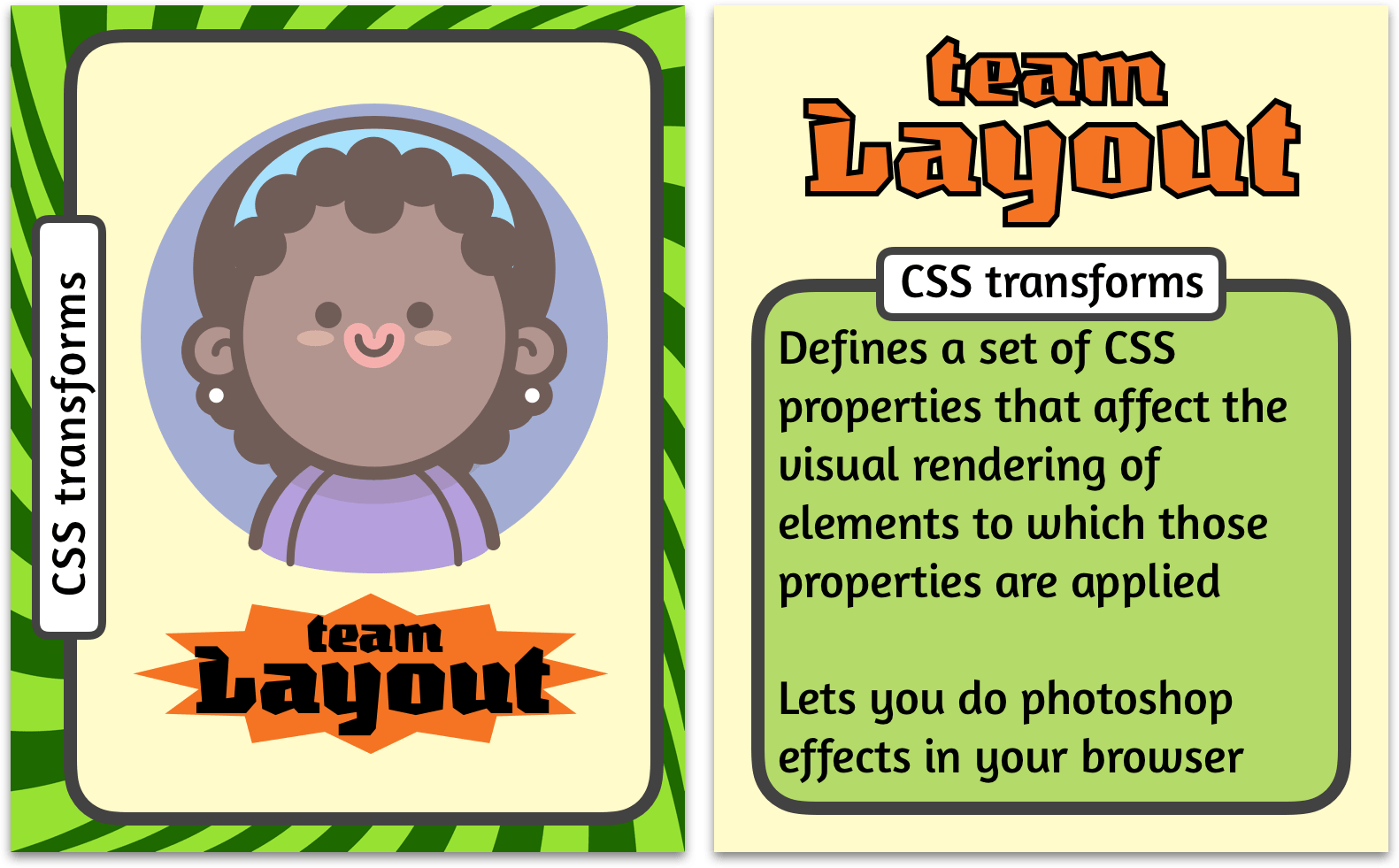
Creating CSS pencils
(Transforms edition)
- Mark-up
- Visual styles
- Layout styles
1. Mark-up
-
This is a pencil
-
A CSS only pencil
-
Because why not
-
This is a pencil
-
A CSS only pencil
-
Because why not
2. Visual styles
-
This is a pencil
-
A CSS only pencil
-
Because why not
3. Layout styles
-
This is a pencil
-
A CSS only pencil
-
Because why not
What happens when you apply a transform?
- establishes a new local coordinate system at the element that it is applied to
- does not affect the flow of the content surrounding the transformed element
- results in the creation of a stacking context
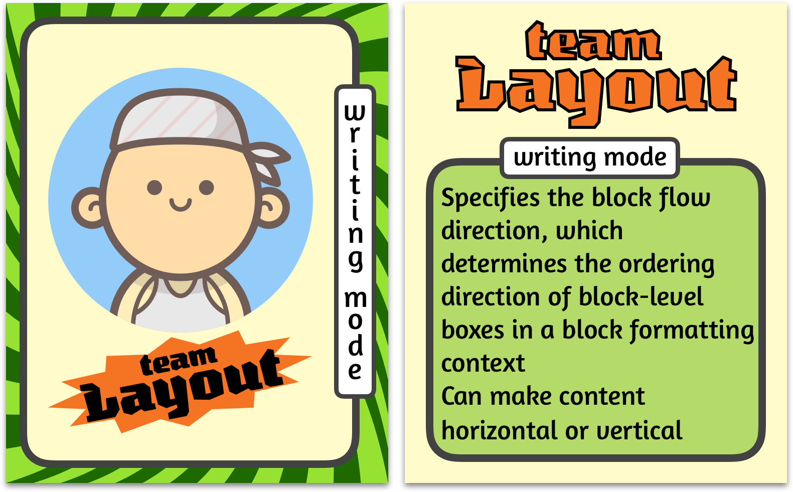
CSS Writing Modes
Defines CSS features to support for various international writing modes, such as left-to-right (e.g. Latin or Indic), right-to-left (e.g. Hebrew or Arabic), bidirectional (e.g. mixed Latin and Arabic) and vertical (e.g. Asian scripts).
writing-mode property
| horizontal-tb | 从1987到现在 |
| vertical-rl | 从1987到现在 |
| vertical-lr | 从1987到现在 |
| sideways-rl* | 从1987到现在 |
| sideways-lr* | 从1987到现在 |
text-orientation property
text-combine-upright property
Creating CSS pencils
(writing-mode edition)
- Mark-up
- Layout and visual styles
1. Mark-up
-
This is a pencil
-
A CSS only pencil
-
Because why not
-
This is a pencil
-
A CSS only pencil
-
Because why not
2. Layout styles
-
This is a pencil
-
A CSS only pencil
-
Because why not
3. Visual styles
-
This is a pencil
-
A CSS only pencil
-
Because why not

Moar pencils, please
-
This is a pencil
-
A CSS only pencil
-
Because why not
-
This is a pencil
-
A CSS only pencil
-
Because why not
-
This is a pencil
-
A CSS only pencil
-
Because why not
-
This is a pencil
-
A CSS only pencil
-
Because why not
-
This is a pencil
-
A CSS only pencil
-
Because why not
-
This is a pencil
-
A CSS only pencil
-
Because why not
-
This is a pencil
-
A CSS only pencil
-
Because why not
-
This is a pencil
-
A CSS only pencil
-
Because why not
-
This is a pencil
-
A CSS only pencil
-
Because why not
-
This is a pencil
-
A CSS only pencil
-
Because why not
-
This is a pencil
-
A CSS only pencil
-
Because why not
-
This is a pencil
-
A CSS only pencil
-
Because why not
-
This is a pencil
-
A CSS only pencil
-
Because why not
-
This is a pencil
-
A CSS only pencil
-
Because why not
-
This is a pencil
-
A CSS only pencil
-
Because why not
-
This is a pencil
-
A CSS only pencil
-
Because why not
Mixed writing-modes?
-
This is a pencil
-
A CSS only pencil
-
Because why not
-
This is a pencil
-
A CSS only pencil
-
Because why not
-
This is a pencil
-
A CSS only pencil
-
Because why not
-
This is a pencil
-
A CSS only pencil
-
Because why not
-
This is a pencil
-
A CSS only pencil
-
Because why not
-
This is a pencil
-
A CSS only pencil
-
Because why not
-
This is a pencil
-
A CSS only pencil
-
Because why not
-
This is a pencil
-
A CSS only pencil
-
Because why not
Single dimension daisy chains


Re-ordering flow
-
This is a pencil
-
A CSS only pencil
-
Because why not
-
This is a pencil
-
A CSS only pencil
-
Because why not
-
This is a pencil
-
A CSS only pencil
-
Because why not
-
This is a pencil
-
A CSS only pencil
-
Because why not
-
This is a pencil
-
A CSS only pencil
-
Because why not
-
This is a pencil
-
A CSS only pencil
-
Because why not
-
This is a pencil
-
A CSS only pencil
-
Because why not
-
This is a pencil
-
A CSS only pencil
-
Because why not
“Grid works from the container in,
other layout methods start with the item”
—Rachel Andrew
Layout technique: inline-block
Item A
Item B
Item C
Item D
Item E
Item F
Layout technique: float
Item A
Item B
Item C
Item D
Item E
Item F
Layout technique: flex
Item A
Item B
Item C
Item D
Item E
Item F
Established relationship between rows and columns

Diagram inspired by Brenda Storer's Using CSS in the real world talk.
Using grid-column and grid-row
⚽️
🏀
🏈
⚾️
🎾
🏐
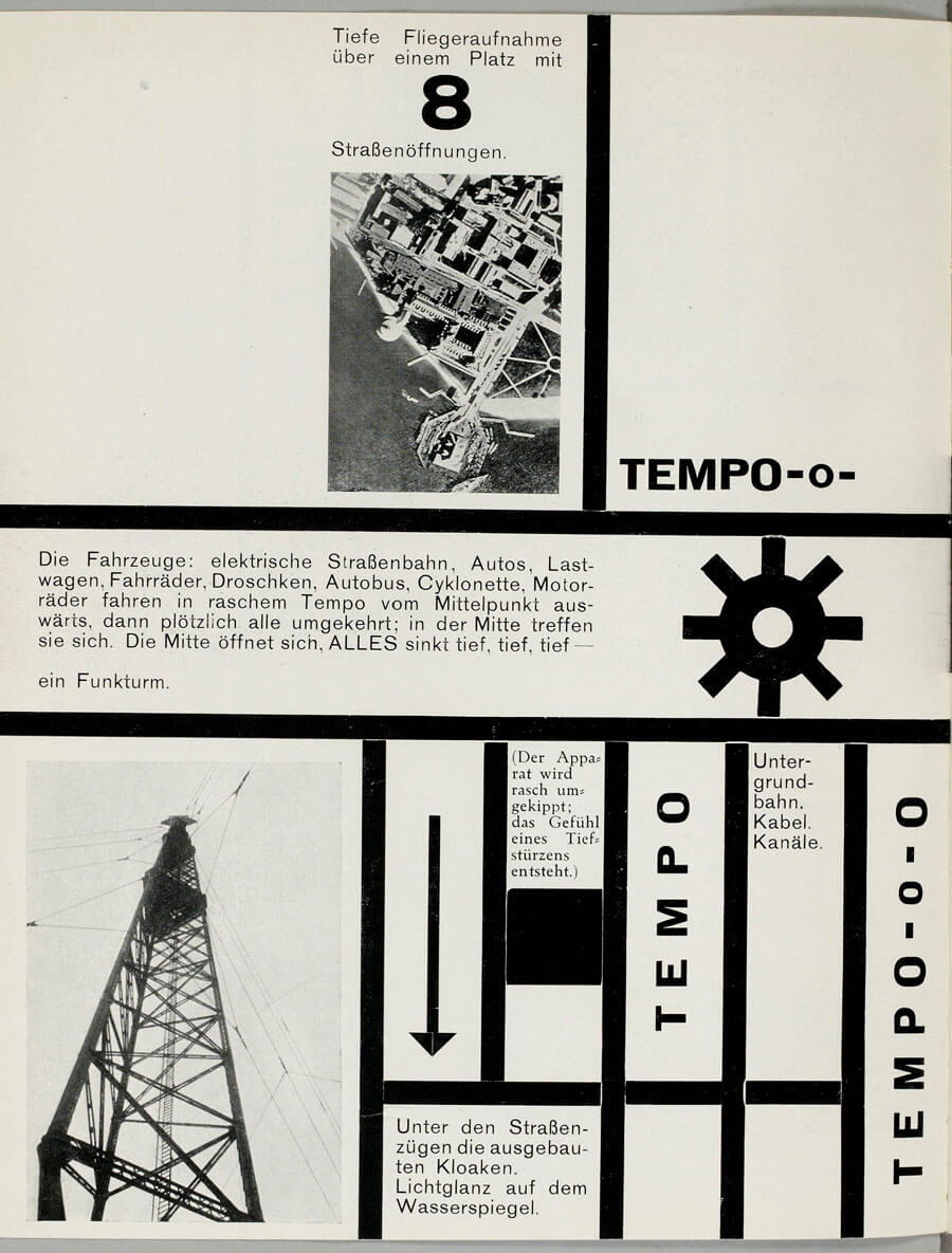
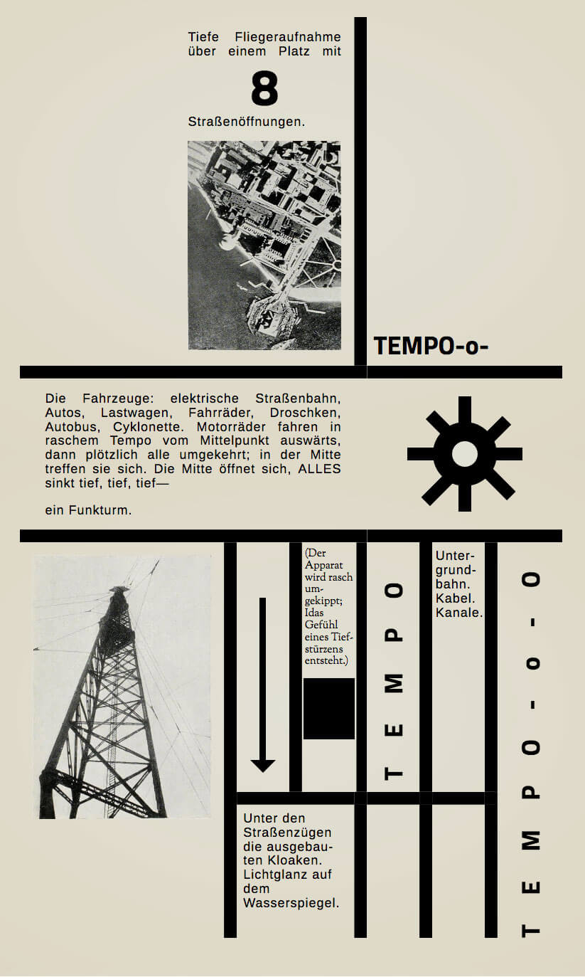
Original image from Moholy-Nagy, Malerei, Fotografie, Film
Bauhaus in the browser
Featuring...
- Grid
- Flexbox
- Writing mode
- Transforms
- Box alignment
.grid {
    display: grid;
    grid-template-columns: 30% 9% 9% 9% 9% 9%;
    justify-content: center;
  }

  .grid__item:nth-child(1) {
    grid-column: span 3;
    justify-self: end;
    border-right: 1em solid;
    padding: 1em;
    text-align: justify;
    text-align-last: justify;

    display: flex;
    justify-content: flex-end;
    align-items: center;

    .content {
      max-width: 12em;
      letter-spacing: 1px;
    }

    p:last-of-type {
      margin-bottom: 1em;
    }
  }

  .grid__item:nth-child(2) {
    grid-column: 4 / span 3;
    align-self: end;
    font-size: 200%;
    padding: 0.25em;
  }

  .grid__item:nth-child(3) {
    grid-column: 1 / span 3;
    border-top: 1em solid;
    border-bottom: 1em solid;
    padding: 1em 2em;
    letter-spacing: 1px;
    text-align: justify;

    p:first-child {
      margin-bottom: 1em;
    }
  }

  .grid__item:nth-child(4) {
    grid-column: 4 / span 3;
    border-top: 1em solid;
    border-bottom: 1em solid;

    display: flex;
    align-items: center;
    justify-content: center;
  }

  .grid__item:nth-child(5) {
    grid-row: 3 / 5;
    border-right: 1em solid;
    padding: 1em;

    display: flex;
    align-items: flex-start;
    justify-content: flex-end;

    img {
      width: 100%;
      max-width: 20em;
    }
  }

  .grid__item:nth-child(6) {
    writing-mode: vertical-rl;
    border-right: 1em solid;

    display: flex;
    justify-content: flex-end;
    align-items: center;
  }

  .grid__item:nth-child(7) {
    padding: 0.5em 0.25em;
    font-size: 85%;
    border-right: 1em solid;
  }

  .grid__item:nth-child(8) {
    border-left: 0.5em solid;

    display: flex;
    justify-content: center;
    align-items: center;
  }

  .grid__item:nth-child(9) {
    letter-spacing: 1px;
    padding: 0.5em 0.25em;
    border-right: 1em solid;
  }

  .grid__item:nth-child(10) {
    grid-row: 3 / 5;
    grid-column: 6;
    justify-self: center;
    align-self: center;
  }

  .grid__item:nth-child(11) {
    grid-column: 2 / 4;
    letter-spacing: 1px;
    padding: 0.5em;
    border-top: 1em solid;
    border-right: 1em solid;
  }

  .grid__item:nth-child(12) {
    border-top: 1em solid;
    border-right: 1em solid;
  }

  .grid__item:nth-child(13) {
    border-top: 1em solid;
    border-right: 1em solid;
  }

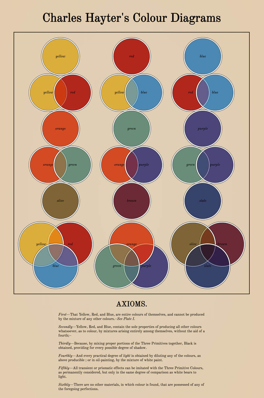
Original image by Charles Hayter
Colour theory with blend-modes
Featuring...
- Grid
- Box alignment
- Blend modes
- Box shadow
.grid1 {
    display: grid;
    grid-template-columns: repeat(3, 2vw 5vw 5vw 5vw 5vw 5vw 2vw);
    grid-auto-rows: 15vw;
    grid-gap: 0.1vw;
    justify-content: center;

    margin-bottom: 1em;
  }

  .grid__item {
    border-radius: 50%;
    border: 0.1vw solid;
    box-shadow: 0px 0px 0px 0.4vw white, 0px 0px 0px 0.5vw black;

    display: flex;
    align-items: center;
    justify-content: center;
  }

  .yel1 {
    grid-row: 1;
    grid-column: 3 / span 3;
    background-color: $yellow;
  }

  .yel2 {
    grid-row: 2;
    grid-column: 2 / span 3;
    background-color: $yellow;
    mix-blend-mode: soft-light;
  }

  .red1 {
    grid-row: 2;
    grid-column: 4 / span 3;
    background-color: $red;
  }

  .org1 {
    grid-row: 3;
    grid-column: 3 / span 3;
    background-color: $orange;
  }

  .org2 {
    grid-row: 4;
    grid-column: 2 / span 3;
    background-color: $orange;
    mix-blend-mode: soft-light;
  }

  .grn1 {
    grid-row: 4;
    grid-column: 4 / span 3;
    background-color: $green;
  }

  .olv1 {
    grid-row: 5;
    grid-column: 3 / span 3;
    background-color: $olive;
  }

  .red2 {
    grid-row: 1;
    grid-column: 10 / span 3;
    background-color: $red;
  }

  .yel3 {
    grid-row: 2;
    grid-column: 9 / span 3;
    background-color: $yellow;
    mix-blend-mode: soft-light;
  }

  .blu1 {
    grid-row: 2;
    grid-column: 11 / span 3;
    background-color: $blue;
  }

  .grn2 {
    grid-row: 3;
    grid-column: 10 / span 3;
    background-color: $green;
  }

  .org3 {
    grid-row: 4;
    grid-column: 9 / span 3;
    background-color: $orange;
    mix-blend-mode: soft-light;
  }

  .prp1 {
    grid-row: 4;
    grid-column: 11 / span 3;
    background-color: $purple;
  }

  .brn1 {
    grid-row: 5;
    grid-column: 10 / span 3;
    background-color: $brown;
  }

  .blu2 {
    grid-row: 1;
    grid-column: 17 / span 3;
    background-color: $blue;
  }

  .red3 {
    grid-row: 2;
    grid-column: 16 / span 3;
    background-color: $red;
    mix-blend-mode: soft-light;
  }

  .blu3 {
    grid-row: 2;
    grid-column: 18 / span 3;
    background-color: $blue;
  }

  .prp2 {
    grid-row: 3;
    grid-column: 17 / span 3;
    background-color: $purple;
  }

  .grn3 {
    grid-row: 4;
    grid-column: 16 / span 3;
    background-color: $green;
    mix-blend-mode: soft-light;
  }

  .prp3 {
    grid-row: 4;
    grid-column: 18 / span 3;
    background-color: $purple;
  }

  .slt1 {
    grid-row: 5;
    grid-column: 17 / span 3;
    background-color: $slate;
  }

  .grid2 {
    display: grid;
    grid-template-columns: repeat(3, 0.5vw 6vw 6vw 6vw 6vw 6vw 0.5vw);
    grid-auto-rows: 9vw;
    grid-gap: 0.1vw;
    justify-content: center;
  }

  .yel4 {
    grid-row: 1 / span 2;
    grid-column: 2 / span 3;
    background-color: $yellow;
    mix-blend-mode: soft-light;
  }

  .red4 {
    grid-row: 1 / span 2;
    grid-column: 4 / span 3;
    background-color: $red;
    mix-blend-mode: soft-light;
  }

  .blu4 {
    grid-row: 2 / span 2;
    grid-column: 3 / span 3;
    background-color: $blue;
  }

  .org4 {
    grid-row: 1 / span 2;
    grid-column: 10 / span 3;
    background-color: $orange;
    mix-blend-mode: soft-light;
  }

  .grn4 {
    grid-row: 2 / span 2;
    grid-column: 9 / span 3;
    background-color: $green;
  }

  .prp4 {
    grid-row: 2 / span 2;
    grid-column: 11 / span 3;
    background-color: $purple;
    mix-blend-mode: soft-light;
  }

  .olv2 {
    grid-row: 1 / span 2;
    grid-column: 16 / span 3;
    background-color: $olive;
    mix-blend-mode: soft-light;
  }

  .brn2 {
    grid-row: 1 / span 2;
    grid-column: 18 / span 3;
    background-color: $brown;
    mix-blend-mode: soft-light;
  }

  .slt2 {
    grid-row: 2 / span 2;
    grid-column: 17 / span 3;
    background-color: $slate;
  }
}Say yes to dynamic layouts
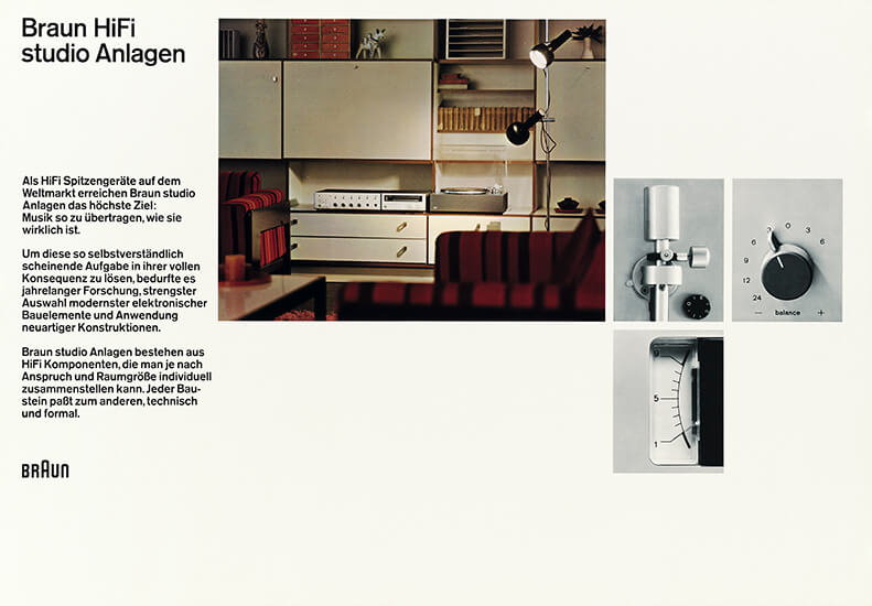
Original image by Wolfgang Schmittel
Full page demo
main {
  display: grid;
  grid-gap: 0.5em;
  grid-template-columns: calc((100vw - 3em) / 3) calc((100vw - 3em) / 3) calc((100vw - 3em) / 3);
  grid-template-areas: "title title title"
                       "text text text"
                       "key key key"
                       "detail1 detail2 detail3"
}

@media screen and (min-aspect-ratio: 1/1) and (min-height: 35em) {
  main {
    grid-template-columns: 18.75em 1fr 1fr 1fr;
    grid-template-rows: calc((100vh - 3em) / 3) calc((100vh - 3em) / 3) calc((100vh - 3em) / 3);
    height: calc(100vh - 2em);
    grid-template-areas: "title key key key"
                         "text key key key"
                         "text detail1 detail2 detail3";
  }

  h1 span {
    display: block;
  }

  img:first-of-type {
    height: calc(((100vh - 2em) / 3) * 2);
    object-fit: cover;
  }

  img:nth-of-type(2),
  img:nth-of-type(3),
  img:nth-of-type(4) {
    height: calc((100vh - 3em) / 3);
    object-fit: cover;
  }

  svg {
    grid-area: text;
    align-self: end;
  }
}

@media screen and (min-aspect-ratio: 8/5) and (min-height: 35em) {
  main {
    grid-template-columns: 18.75em 4fr 1fr 1fr;
    grid-template-rows: calc((100vh - 3em) / 3) calc((100vh - 3em) / 3) calc((100vh - 3em) / 3);
    height: calc(100vh - 2em);
    grid-template-areas: "title key . ."
                         "text key detail1 detail2"
                         "text . detail3 ."
  }

  div {
    margin-top: -2em;
  }
}

h1 {
  grid-area: title;
}

div {
  grid-area: text;
}

img:first-of-type {
  grid-area: key;
}

img:nth-of-type(2) {
  grid-area: detail1;
}

img:nth-of-type(3) {
  grid-area: detail2;
}

img:nth-of-type(4) {
  grid-area: detail3;
}Art direction for the web
Original design by Drew Sullivan
Full page demo
@media (min-width: 42em) and (min-height: 27em) {
  main {
    max-width: none;
    padding: 0;
    display: grid;
    grid-template-columns: 2fr minmax(10em, max-content) minmax(14em, max-content) minmax(1em, 1fr) fit-content(28em) calc(2em + 0.5vw);
    grid-template-rows: 35vh 40vh 15vh 10vh;
  }

  h1 {
    grid-column: 3 / 6;
    grid-row: 1 / 2;
    z-index: 2;
    padding-left: 0.25em;
    margin-bottom: initial;
  }

  h2 {
    grid-row: 1 / -1;
    grid-column: 6 / 7;
    writing-mode: vertical-rl;
    margin-bottom: initial;
    color: $text;
  }

  hr {
    grid-column: 5 / 6;
    grid-row: 2;
    height: 6px;
    background-color: $text;
    width: 20ch;
  }

  .about {
    grid-column: 5 / 6;
    grid-row: 2;
    align-self: end;
    padding-bottom: 4vh;
    margin-bottom: initial;
  }

  a {
    grid-column: 5 / 6;
    justify-self: end;
    align-self: center;
    margin-bottom: initial;

    &::before {
      content: '';
      display: block;
      height: 4px;
      background-color: $accent;
      width: 4ch;
      margin-bottom: 1em;
    }
  }

  img {
    grid-column: 1 / 4;
    grid-row: 1 / 4;
  }

  .location {
    grid-column: 3 / 4;
    grid-row: 3 / 4;
    z-index: 2;
    background: $main;
    text-align: center;
    display: flex;

    p {
      margin: auto;
    }
  }

  button {
    grid-column: 2 / 3;
    grid-row: 4 / 5;
    position: initial;
    padding: 0;
  }

@media (min-width: 48em) and (min-height: 27em) {
  hr {
    opacity: 1;
  }
}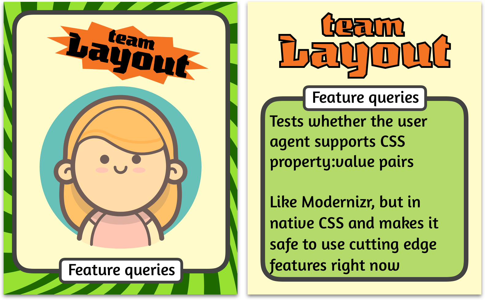
Anatomy of a feature query
.selector {
  /* Styles that are supported in old browsers */
}

@supports (property:value) {
  .selector {
    /* Styles for browsers that support the specified property */
  }
}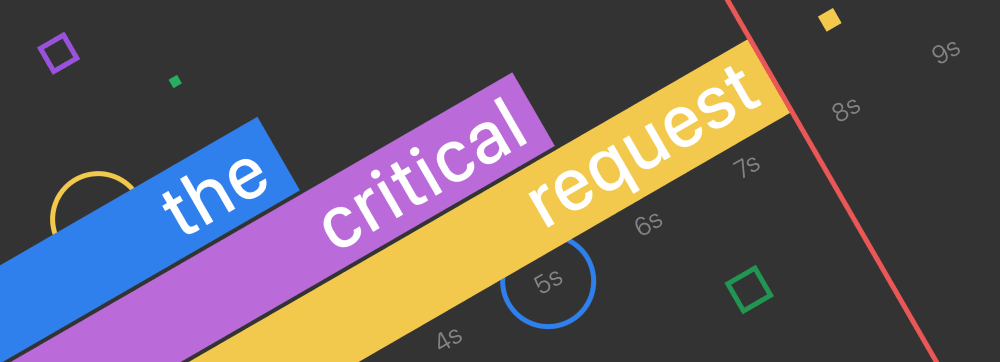
Original image from CSS tricks
header::before {
  content: 'This example requires a browser that supports CSS Flexbox or Grid. If your browser did support CSS Grid, you would have seen something that resembles the image below, except recreated in HTML and CSS instead.';
  display: inline-block;
  background-color: rgba(253, 182, 182, 0.75);
  font-size: initial;
  max-width: 36em;
  color: #000;
  padding: 0.5em;
}

header > * {
  display: none;
}

header {
  background-color: $background;
  background-image: url('./fallback.png');
  background-size: contain;
  background-repeat: no-repeat;
  background-position: bottom;
  overflow: hidden;
  max-height: 60vh;
  position: relative;
}

@media screen and (max-width: 480px) {
  header {
    min-height: 20em;
  }
}

@media screen and (min-width: 480px) {
  header {
    min-height: 16em;
  }
}

@supports (display: flex) {
  header::before {
    content: none;
  }

  header {
    background-image: none;
  }

  .grid {
    display: block;
  }

  .title {
    color: $txt-light;
    display: flex;
    align-items: center;
    justify-content: flex-end;
    font-size: 2.5em;
    z-index: 1;
    padding-right: 0.25em;
  }

  .time {
    color: $txt-dark;
    display: flex;
    align-items: center;
    justify-content: center;
    padding: 0 0.5em;
  }

  .grid__item:nth-of-type(1) {
    background-color: $blue;
    width: 30vw;
  }

  .grid__item:nth-of-type(2) {
    background-color: $purple;
    width: 45vw;
  }

  .grid__item:nth-of-type(3) {
    background-color: $yellow;
    width: 60vw;
    position: relative;
    z-index: 2;
  }

  .time {
    width: calc(100% / 9);
    float: left;
    padding: 1em;
  }

  .time:nth-child(8) {
    position: relative;

    &::before {
      display: block;
      content: '';
      height: 3.5em;
      width: 3.5em;
      border-radius: 50%;
      position: absolute;
      border: 0.2em solid $blue;
      z-index: 1;
    }
  }

  .border {
    width: 0.2em;
    background-color: $red;
    position: absolute;
    top: 0;
    height: 100%;
    left: calc((100% / 9) * 7);
  }
}@supports (display:grid) {
.time {
grid-row: 7;
}
.grid {
display: grid;
grid-template-columns: repeat(9, 1fr);
grid-template-rows: repeat(3, 2em) repeat(3, minmax(10vmin, 3em)) 2em 2em 10vh;
grid-gap: 0.125em;
position: relative;
}
@media screen and (min-width: 480px) {
.grid {
transform: rotate(-30deg) translateX(5vh);
grid-template-rows: repeat(3, 2em) repeat(3, minmax(10vmin, 3em)) 2em 2em 50vh;
}
}
@media screen and (min-width: 640px) {
.grid {
transform: rotate(-30deg) translateY(-15vh);
}
}
.grid__item:nth-of-type(1) {
grid-row: 4;
grid-column: span 3;
width: auto;
}
.grid__item:nth-of-type(2) {
grid-row: 5;
grid-column: span 5;
width: auto;
}
.grid__item:nth-of-type(3) {
grid-row: 6;
grid-column: span 7;
width: auto;
}
.border {
grid-row: 1 / -1;
grid-column: 8;
margin-left: -0.125em;
width: 1px;
border-left: 0.2em solid $red;
left: initial;
}
.square1 {
grid-column: 2;
position: relative;
&::before {
display: block;
content: '';
height: 1.25em;
width: 1.25em;
border: 0.2em solid $purple;
position: absolute;
right: 0;
}
}
.square2 {
grid-column: 3;
grid-row: 2;
position: relative;
&::before {
display: block;
content: '';
height: 0.5em;
width: 0.5em;
background-color: $green;
position: absolute;
right: 1em;
top: 1em;
}
}
.circle {
grid-column: 2;
grid-row: 3;
position: relative;
&::before {
display: block;
content: '';
border: 0.2em solid $yellow;
border-radius: 50%;
position: absolute;
height: 4em;
width: 4em;
top: calc(50% - 0.5em);
left: calc(50% - 2em);
}
}
.square3 {
grid-column: 8;
grid-row: 6;
position: relative;
&::before {
display: block;
content: '';
height: 0.75em;
width: 0.75em;
background-color: $yellow;
position: absolute;
right: 0;
top: 1em;
}
}
.square4 {
grid-column: 6;
grid-row: 8;
position: relative;
&::before {
display: block;
content: '';
height: 1.5em;
width: 1.5em;
position: absolute;
right: 0;
top: 100%;
border: 0.2em solid $green;
}
}
}

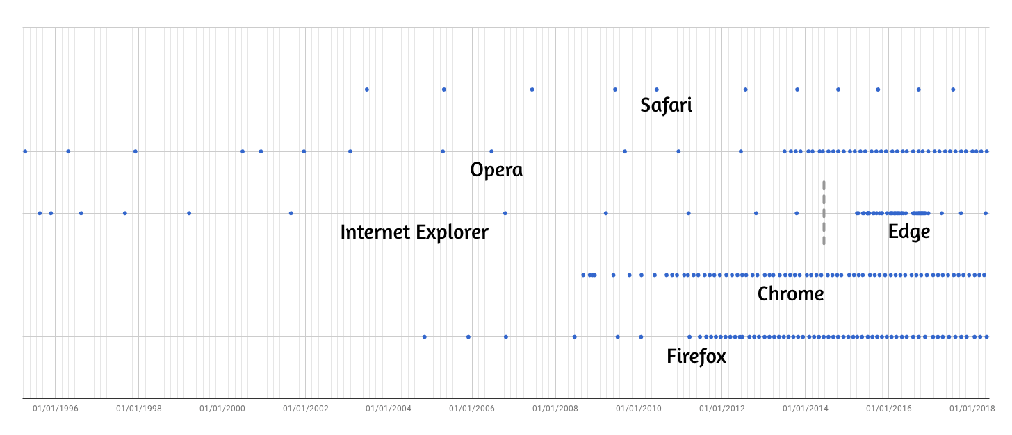
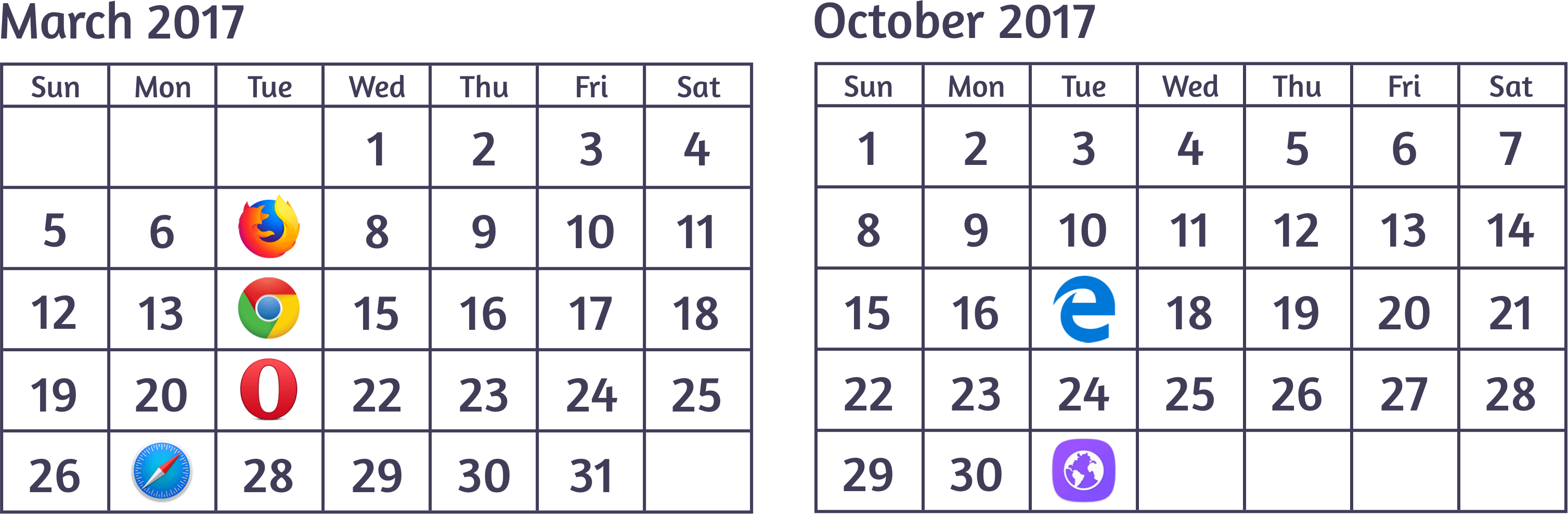
Frequency of major browser releases
CSS Grid release dates
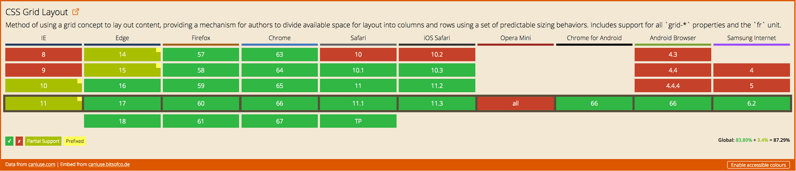
CSS Grid browser support
Thank you!


Font used is Amaranth, by Gesine Todt