Building layouts the way the web intended
By Chen Hui Jing / @hj_chen

Screens, screens, screens
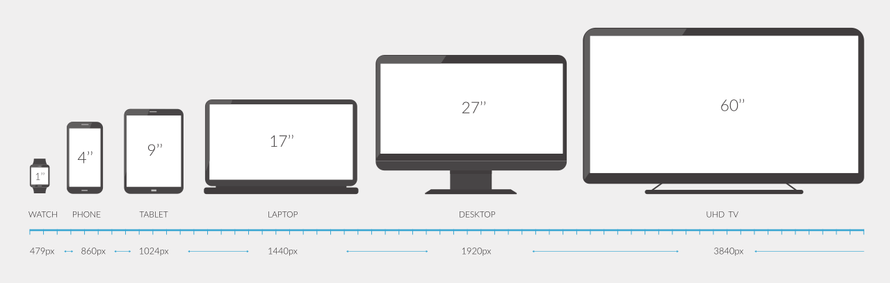
Image credit: Jyotika Sofia Lindqvist
Layout technique: float
Item A
Item B
Item C
Layout technique: inline-block
Item A
Item B
Item C
The parent-child relationship

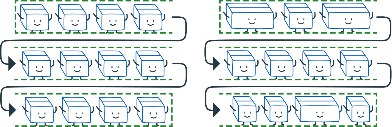
Layout technique: flex
A flex item
Another flex item
Flex items are also flex children
All direct children of the flex container become flex children
Flex formatting context


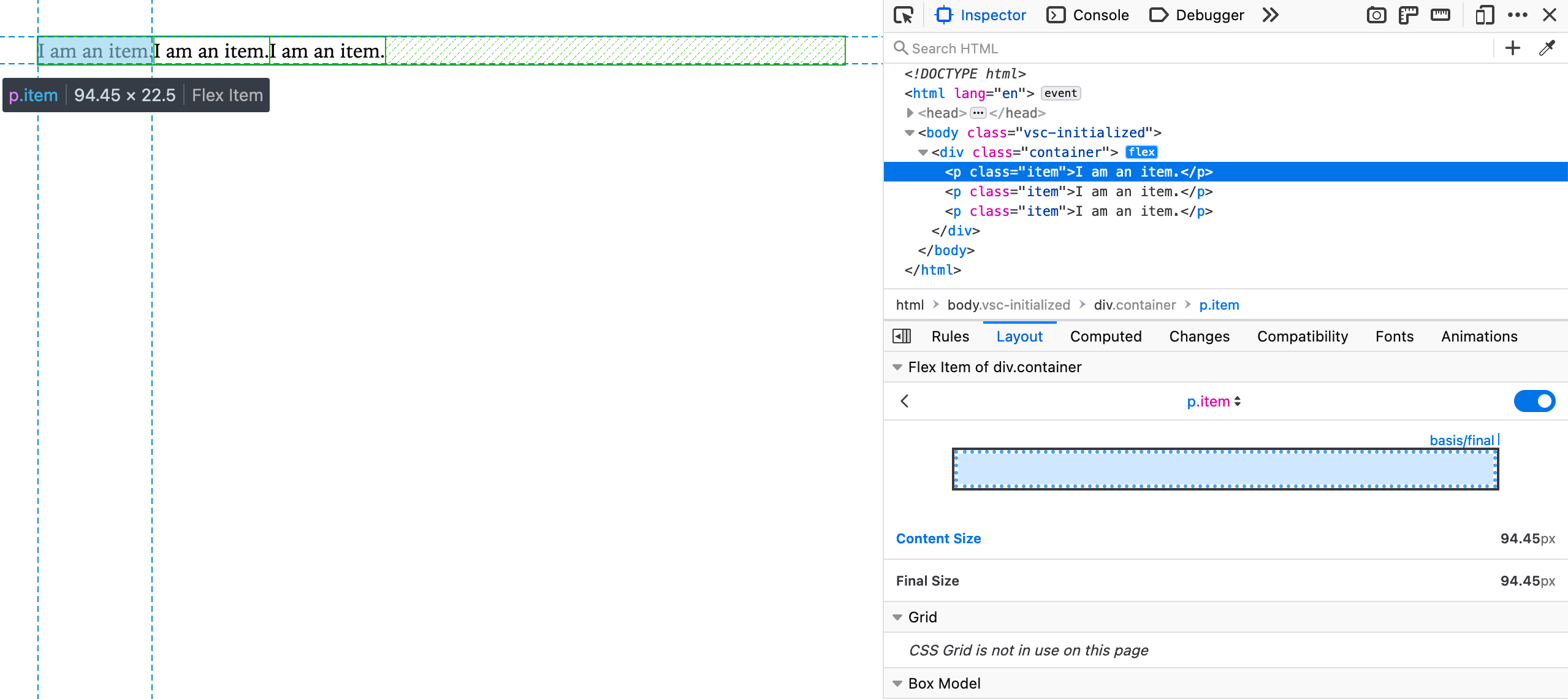
Flexbox devtools
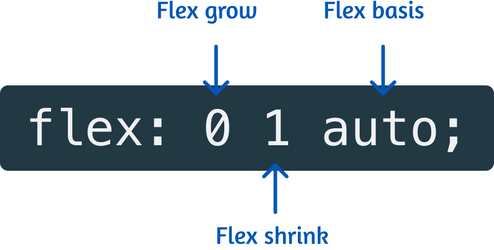
The flex property
Sizing in flexbox
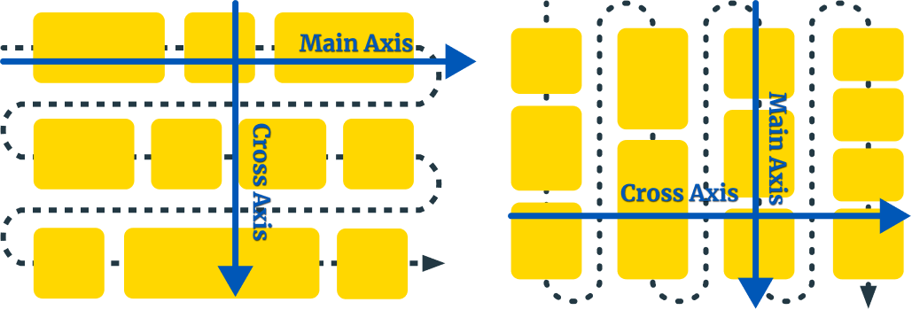
Flex directions
No actual grid
Real two-dimensional awareness
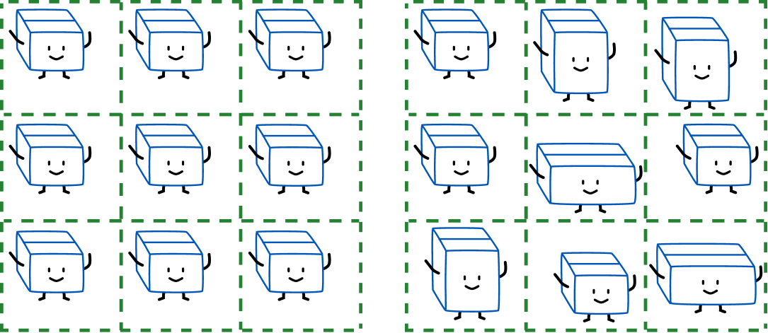
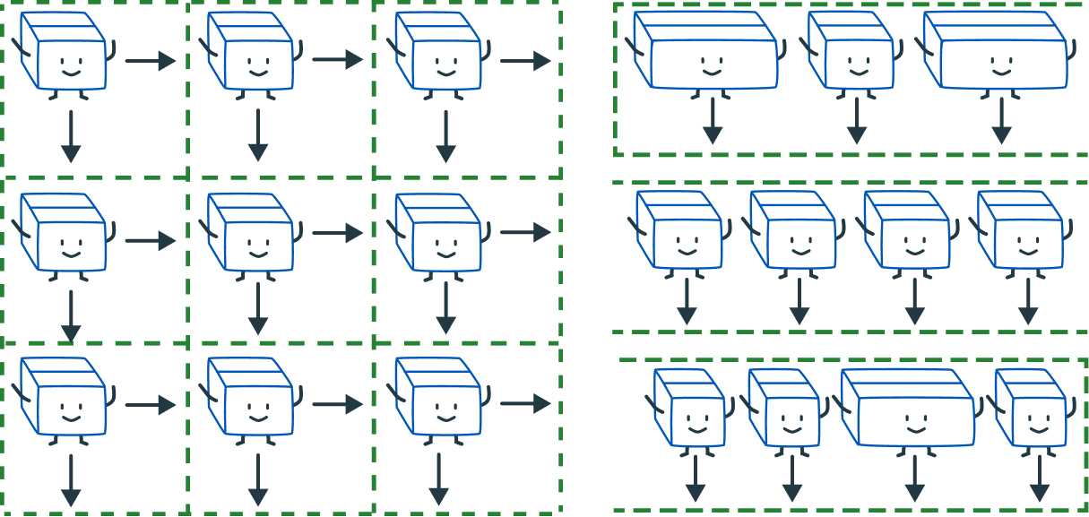
Layout technique: grid
Item A
Item B
Item C
Item D
Item E
Item F
A better way of building grids
The magic sauce
No, just kidding. It's just that alignment really ties it all together.
Box alignment properties
| Property | Axis | Aligns | Applies to |
|---|---|---|---|
justify-content |
main/inline | content within element  |
block containers, flex containers and grid containers |
align-content |
cross/block | ||
justify-items |
inline | items inside box  |
block containers and grid containers |
align-items |
cross/block | flex-containers and grid-containers |
|
justify-self |
inline | element within parent  |
block-level boxes, absolutely-positioned boxes and grid items |
align-self |
cross/block | absolutely-positioned boxes, flex items and grid items |
Can we put it all together?
Дякую!


Font is Bitter by Huerta Tipografica.
Sunflower illustration by pikisuperstar