Architecting CSS grid in a design system
By Chen Hui Jing / @hj_chen
Hello everyone! This is the first conference I'm speaking at since COVID happened so it does feel kind of surreal. I'm very happy to be here and grateful to the organisers for giving me the opportunity to talk to all of you about my favourite topic in the world, CSS.
We're at a frontend conference today, right? So I'm going to assume a lot of us are in the business of displaying web content on a digital screen. Which could be of any and all sizes. That to me, is the fun of building for the web.
🇲🇾
👾
🏀
🚲
🖌️
👟
💻
🖊️
🎙
🐈⬛
🧗
🏳️🌈
My name is Hui Jing. It's a Chinese name, so my family name comes first. I'm not a complicated person, so these emojis pretty much cover who I am as a person.
I also have a day job, with Shopify, as a senior frontend developer. Because you know, I like being able to pay my rent and stuff.
Screens, screens, screens
Image source: Inch Calculator
So why are we talking about CSS today? If your content is going to be rendered by a browser engine, then your main mode of communication with the browser for styling content has to be CSS. And I'm sure everyone today has their own opinion about CSS, some of you might love it as much as I do, while others might see of it as a hard-to-deal with API you would like to avoid as much as possible.
Regardless of your opinions on CSS, I'm not here to tell you what to think or how to feel. The reality is that browser engines today are much more capable than before, they can lay out content much better than before. And it's in our best interest to know how to make full use of the browser's web layout capabilities.
Technology evolves very fast, I know, but as of now, most web interactions involve a screen. And these screens can be as small as a watch-face or as large as a 70-inch super HDTV. And you, the developer or designer or creator, can't really control this.
Image credit: Jyotika Sofia Lindqvist
This means, the way we think about designing layouts on the web cannot be like anything else that is fixed. It's quite a different mental model, and so, the tools we use must suit this fluid, interactive medium. Luckily for us, now that Flexbox and Grid are very well supported across all major browsers, our toolbox has been greatly upgraded.
Both of these layout models were introduced after the web had evolved into more than just a document viewer. They were built to handle application interfaces which would be viewed across many different screen sizes.
            .wrapper {
  display: -webkit-box;
  display: -webkit-flex;
  display: -ms-flexbox;
  display: flex;
}
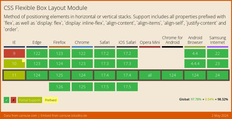
MDN: Backwards Compatibility of Flexbox Admittedly, Flexbox had a relatively rocky rollout, as browsers implemented experimental versions of the syntax before the specification had been nailed down. But by 2015, all the major browsers had updated to use the latest specification and the implementation was considered stable.
Browser configuration pages
about:config
chrome:://flags
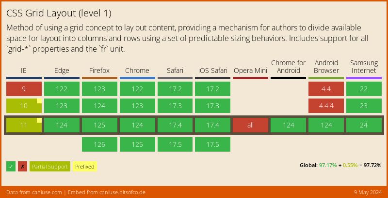
Browser vendors and specification authors learned from the Flexbox rollout and did Grid differently. They still needed to developers like you and I to test out this new layout model, but instead of using vendor prefixes, they chose to implement the pre-finalised version of Grid behind a feature flag.
This meant that if developers wanted to use it, they had to manually access the browser's configuration, you know, that page that warns you your warranty is null and void if you change things? No, I'm kidding, but it does make it clear that you could potentially break something.
Non-developers would most likely never encounter nor attempt to access these settings, hence, this approach allowed browser vendors to still collect feedback from web developers while minimising the odds that they would actually ship an un-finalised syntax to production before the implementation itself was ready and mature.
Grid release dates
Grid was rolled out in a very coordinated manner back in 2017, with the four major browsers all shipping in the month of March, and by October, even Edge and Samsung Internet got it.
Fast forward to today, the percentage of internet users surfing the web with browsers that support Flexbox and Grid is overwhelmingly high. So browser support is no longer a valid argument for why adoption rates are lower than expected.
State of CSS 2021 survey
Flexbox: 98.9%
Grid: 83.5%
https://2021.stateofcss.com/en-US/
For what it's worth, Flexbox is everywhere. It has become the go-to for many web layouts, and after seeing my thousandth “how to centre something vertically” article, I'm not surprised it caught on very well.
And even though this survey has a relatively small sample size of 8075 developers, it still prompted me to wonder Grid's usage numbers are not as high as I expected.
Among the 13 links I have in my bookmarks bar, I could only find Grid usage on CodePen, Discord, Imbox and Spotify. And only Spotify seemed to really embrace Grid as a page layout tool. Named grid areas and all.
⚠️ Disclaimer ⚠️
The following theory may or may not oppose your view on the matter, and that is PERFECTLY FINE. I am not here to tell you what to think, merely here to share a theory based on my personal observations and experiences. You are absolutely free to agree, disagree or not care at all.
I have a theory.
It has to do with how people have been using and building for the web over the years. Once the web protocol and source code was released into the public domain, it really started to take off. People started creating websites left-right-and-centre.
You could share your love of your favourite band, or talk about your life like a diary, or post pictures of cats, all from behind your keyboard. Lots of other people, whom you might never meet in person, could consume all that content, also from behind their keyboards. And you know what else people realised they could do? They could create websites to sell stuff and make a buck.
Dotcom bubble (1995-2002)
Source: The History of the Dotcom Bubble
The dotcom bubble did burst eventually but it did not erase the fact that the web is a place where you can run an economically viable business. If we boil it down, the web is a data transmission technology, a tool that we leverage for many different purposes.
I've heard opinions that express some level of dismay of how complicated the web has become. And I won't deny that the web can be complicated, but it has retained much of its original simplicity as well. I don't think it's hyperbole to say that if you knew how to create and publish a website back in 1994, you could still create and publish that same website today.
Source: Michel Buffa's Video Games Page in 1994
Sure, maybe you'd have to figure out a modern web hosting solution, but this is a website, and it can exist on the internet today, just like it did back in 1994. It's just that when commerce and money is involved, complexity becomes inevitable, in my humble opinion.
Javascript came into the picture in 1995, because there was a need for a scripting language that could run on the client-side, apparently to do form validation. Not sure how true that part is, but needing a lightweight scripting language that could run on the client was real.
A couple years later, the concept of AJAX, short for Asynchronous Javascript and XML, started to take off because it allowed content on the page to be updated dynamically without reloading the entire page. The concept on which Single Page Applications or SPAs are built on.
This term “Single Page” is so misleading to me, because my mind has anchored the word page to physical books. So even the largest book I can think of is around this size. But when you think about a lot of the SPAs out there these days, it's more like a page the size of this room.
With the increase in scale and hence complexity, the organisation of code becomes a lot more crucial. Frameworks can help provide structure, but with it comes some restrictions on how to do things.
I've found that I haven't encountered folks discussing how it was like to implement CSS grid within the bounds of their framework of choice. Personally, I'd love to hear how folks at different organisations deal with the constraints unique to their context.
Parent-child relationship
Let's do a quick run-through of how Grid works and how to use it. Similar to Flexbox, it involves a parent-child relationship between the container and its immediate children. Grid properties on the container will have an impact on the grid items, and grid items themselves have an "awareness" of their siblings.
Basic grid syntax
Item A
Item B
Item C
Item D
Item E
Item F
Item G
Item H
Item I
The bare minimum to start using grid as a layout tool is setting display to grid, then defining some columns. Theoretically, you don't even have to be explicit with the rows unless you want to. Because the row height will naturally be whatever it needs for the content to fit.
If your grid needs to be more complicated, there are helpful properties and functions available to keep your code neat. The gap property makes it easy to have spacing between your grid items. The repeat() function, which can let you DRY out your code.
Named grid areas
Banner
Links and stuff?
Your main content
Footer, for copyright and moar links?
A particularly useful feature which I'm a big fan of is named grid areas. Which you might have noticed in the screenshot earlier of Spotify's interface. After you've set up your rows and columns, you can explicitly name specific areas of the grid via a rather visual syntax.
The structure of the grid-template-areas value is a reflection of your grid, so each of these 3 lines enclosed with quotes corresponds to the 3 rows, while each value within the line corresponds to a column.
I make use of this for designs that need to break at multiple viewport widths because all my changes can be contained on the parent selector. Once I've assigned each grid item its area, I don't need to change it regardless of what I do to the parent.
Placing grid items
Not my cat
He just naps in my house sometimes. But isn't he super cute?
Naming grid areas is optional, a “regular” way of placing items is to define its grid-row and grid-column properties. If you turn on the grid inspector, you can see the grid line numbers and decide where you want your items to start and end.
Grid makes overlapping elements in your design more controllable than other methods which involve absolute positioning, transforms or negative margins. Because you can plan how the overlap should occur across the range of viewports you're working with.
Container-led sizing
Item-led sizing
There's more to Grid than what I've mentioned, but this is sufficient for a large range of use cases already. A major difference between building layouts with Grid versus other layout models is that CSS grid layouts are “led” by the container. You implement your intended layout on the container in a sort of big-picture way, and the items are placed accordingly.
Whereas the other layout models are item led, where the sizing and positioning of each item is determined by properties on the items themselves. It is a little different from what a lot of folks are used to, and perhaps that is a contributing factor to why CSS grid is not as widespread as it could be.
But it's not like Grid is the end-all-be-all of layout building on the web. It is just one more additional tool we have in our toolbox. Floats are still great for actually floating content. Flexbox is great for handling free space, or the lack thereof, in your layout. Grid is perfect for when you want structured rows and columns.
Common example of grid system CSS
“Bootstrap’s grid system uses a series of containers, rows, and columns to layout and align content.”
.col-sm {
  flex: 1 0 0%;
}
.row-cols-sm-auto > * {
  flex: 0 0 auto;
  width: auto;
}
.row-cols-sm-1 > * {
  flex: 0 0 auto;
  width: 100%;
}
.row-cols-sm-2 > * {
  flex: 0 0 auto;
  width: 50%;
}
.row-cols-sm-3 > * {
  flex: 0 0 auto;
  width: 33.3333333333%;
}
.row-cols-sm-4 > * {
  flex: 0 0 auto;
  width: 25%;
}
.row-cols-sm-5 > * {
  flex: 0 0 auto;
  width: 20%;
}
.row-cols-sm-6 > * {
  flex: 0 0 auto;
  width: 16.6666666667%;
}
.col-sm-auto {
  flex: 0 0 auto;
  width: auto;
}
.col-sm-1 {
  flex: 0 0 auto;
  width: 8.33333333%;
}
.col-sm-2 {
  flex: 0 0 auto;
  width: 16.66666667%;
}
.col-sm-3 {
  flex: 0 0 auto;
  width: 25%;
}
.col-sm-4 {
  flex: 0 0 auto;
  width: 33.33333333%;
}
.col-sm-5 {
  flex: 0 0 auto;
  width: 41.66666667%;
}
.col-sm-6 {
  flex: 0 0 auto;
  width: 50%;
}
.col-sm-7 {
  flex: 0 0 auto;
  width: 58.33333333%;
}
.col-sm-8 {
  flex: 0 0 auto;
  width: 66.66666667%;
}
.col-sm-9 {
  flex: 0 0 auto;
  width: 75%;
}
.col-sm-10 {
  flex: 0 0 auto;
  width: 83.33333333%;
}
.col-sm-11 {
  flex: 0 0 auto;
  width: 91.66666667%;
}
.col-sm-12 {
  flex: 0 0 auto;
  width: 100%;
}
      One of three columns


      One of three columns


      One of three columns
As an application grows bigger, with more features, more components and more pages, you end up having to adopt some sort of design system, or at least, develop some design guidelines to maintain consistency across the application. And often, a grid system is part of that.
A common pattern for grid systems in frontend libraries rely on generating all the classes needed for all the percentages needed for the sizing of each item in the grid. To migrate from using floats to flexbox is actually not that drastic a refactor, because your sizing still happens on the item class. Migrating to grid, on the other hand, is relatively more complicated.
A pretty standard grid
Size
Min
Max
Cols
Margin
Gutter
xs
320px
639px
4
16px
16px
sm
640px
899px
8
30px
16px
md
900px
1199px
12
50px
16px
lg
1200px
1599px
12
90px
24px
xl
1600px
-
12
>180px
24px
Let's simplify things a little bit for the sake of discussion. Say we have the luxury of implementing a brand new design system, and we want to build out the grid system for that. So here, we have these specifications for a rather standard looking grid. It has different values to accommodate a range of viewport sizes.
There are plenty of different approaches you could take to write CSS grid code to implement this in an application powered by a Javascript framework. We'll go through a couple of them just to give you an idea. I'm using React here, but I think these ideas are transferable to other frameworks as well.
Option 1: vanilla CSS (or SCSS)
Size
Min
Max
Cols
Margin
Gutter
xs
320px
639px
4
16px
16px
sm
640px
899px
8
30px
16px
md
900px
1199px
12
50px
16px
lg
1200px
1599px
12
90px
24px
xl
1600px
-
12
>180px
24px
              .grid {
  min-width: 320px;
  max-width: 1600px;
  display: grid;
  grid-template-columns: repeat(4, 1fr);
  gap: 1em;
  margin-left: 16px;
  margin-right: 16px;
}

@media screen and (min-width: 640px) {
  .grid {
    grid-template-columns: repeat(8, 1fr);
    margin-left: 30px;
    margin-right: 30px;
  }
}

@media screen and (min-width: 900px) {
  .grid {
    grid-template-columns: repeat(12, 1fr);
    margin-left: 50px;
    margin-right: 50px;
  }
}

@media screen and (min-width: 1200px) {
  .grid {
    gap: 1.5em;
    margin-left: 90px;
    margin-right: 90px;
  }
}

@media screen and (min-width: 1600px) {
  .grid {
    margin-left: 180px;
    margin-right: 180px;
  }
}
One option is to just write the CSS. The rationale for this approach is that the grid would inform where everything on the application would sit within the interface. Hence, it could live in the global stylesheet that gets loaded everywhere, since the expectation is that it would be used everywhere.
All of the specifications from the table above would be defined on the grid container, while placement of items within the grid can be assigned to each individual grid item (if necessary) or be auto-placed by the browser.
Option 1: vanilla CSS (or SCSS)
            .grid__item--full,
.grid__item--half,
.grid__item--third,
.grid__item--quarter {
  grid-column: 1 / -1;
}

@media screen and (min-width: 640px) {
  .grid__item--quarter {
    grid-column: span 4;
  }
}

@media screen and (min-width: 900px) {
  .grid__item--half {
    grid-column: span 6;
  }

  .grid__item--third {
    grid-column: span 4;
  }

  .grid__item--quarter {
    grid-column: span 3;
  }
}
This approach allows the item placement code to go on the component styles. And if there are common placement patterns that recur very often in the design, then you could consider having some pre-written styles to cater to those situations.
Option 1: vanilla CSS (or SCSS)
            .custom-thingy {
  grid-column: 1 / -1;
  font-size: var(--step-1);
}

@media screen and (min-width: 640px) {
  .custom-thingy {
    grid-column: 1 / 6;
    padding-top: 2em;
    padding-bottom: 1em;
  }
}

@media screen and (min-width: 900px) {
  .custom-thingy {
    grid-column: 1 / 7;
  }
}
And if you do need some custom placement, that code could go into the component-specific styles instead.
Option 2: Container and Item components
            src/
└── components/
    ├── Col/
    │   ├── Col.module.css
    │   └── Col.tsx
    └── Grid/
        ├── Grid.module.css
        └── Grid.tsx
Another approach is to have wrapper components for the container and item respectively. This means the grid code is tied to the wrapper components instead of being loaded in the global stylesheet.
I ran into some specificity issues with this approach with CSS modules that I managed to workaround relatively painlessly, but it is something to take note of.
The setup involves creating a Grid component and a Col component and their corresponding stylesheets.
Grid.tsx
                import { ReactNode, createElement } from "react";
import styles from "./Grid.module.scss";

interface GridProps extends React.HTMLProps {
  className?: string;
  children: ReactNode;
  tag?: keyof JSX.IntrinsicElements;
}

export default function Grid({
  className = "",
  children,
  tag = "div",
  ...props
}: GridProps) {
  const Wrapper = tag;
  return createElement(
    Wrapper,
    {
      className: `${styles.grid} ${className}`,
      ...props
    },
    children
  );
}
Col.tsx
                import { ReactNode, createElement } from "react";
import cn from "classnames";
import styles from "./Col.module.scss";

interface ColProps extends React.HTMLProps {
  className?: string;
  children: ReactNode;
  colWidth?: "full" | "half" | "third" | "quarter";
  tag?: keyof JSX.IntrinsicElements;
}

export default function Col({
  className = "",
  children,
  colWidth,
  tag = "div",
  ...props
}: ColProps) {
  const Wrapper = tag;

  return createElement(
    Wrapper,
    {
      className: cn(className, { [styles[`${colWidth}`]]: colWidth }),
      ...props
    },
    children
  );
}
These components don’t do much other than provide grid-related styling, so they’re not very big or complicated. They have props for passing custom class names, modifying the element tag (which defaults to div) but generally does not restrict users from passing in other props either.
Col.module.css
            .full,
.half,
.third,
.quarter {
  grid-column: 1 / -1;
}

@media screen and (min-width: 640px) {
  .quarter {
    grid-column: span 4;
  }
}

@media screen and (min-width: 900px) {
  .half {
    grid-column: span 6;
  }

  .third {
    grid-column: span 4;
  }

  .quarter {
    grid-column: span 3;
  }
}
The styles would be the same as in option 1 but because this approach uses CSS modules, you can sort of be more “casual” with naming your classes? The grid container styles are literally exactly the same as option 1, while the item classes can look like this or however you like to name them.
CustomThingy.module.scss
            p.customThingy {
  grid-column: 1 / -1;
  font-size: var( --step-1);
}

@media screen and (min-width: 640px) {
  p.customThingy {
    grid-column: 1 / 6;
    padding-top: 2em;
    padding-bottom: 1em;
  }
}

@media screen and (min-width: 900px) {
  p.customThingy {
    grid-column: 1 / 7;
  }
}
The issue I ran into when using these components was that, if I wanted to override the pre-written item styles, I had to bump the specificity of my component styles up a little bit because CSS modules loaded the component styles before the wrapper styles.
I like to keep specificity low in general, so I went with bumping up by 1 element tag’s worth. If someone more knowledgeable has advice on a better way of dealing with this style loading order, please let me know.
Option 3: Using Tailwind classes
⚠️ Yet Another Disclaimer ⚠️
The following opinion may or may not oppose your view on the matter, and that is PERFECTLY FINE. You are absolutely free to agree, disagree or not care at all.
I'll be up front about this, I'm not the biggest fan of how Tailwind does CSS. The major issue I have with it is, it sees the cascade as a problem to be fixed, rather than attribute to be embraced. If you use Tailwind the way it was intended, the cascade is almost completely negated.
tailwind.config.js
            module.exports = {
  theme: {
    screens: {
      xs: "320px",
      sm: "640px",
      md: "900px",
      lg: "1200px",
      xl: "1600px",
      maxSm: { max: "639px" },
      maxMd: { max: "899px" },
      btwSmMd: { min: "640px", max: "899px" }
    },
  },
  prefix: "tw-"
};
It is called Cascading Stylesheets for a reason. Maybe call it “Tailwind SS” instead? That being said, this is not a hill I need to die on. If my job needs me to write Tailwind, I can still do it the way it was intended.
For now, I accept the reality that there are quite a number of teams that use Tailwind CSS in their applications and it’s working well for them. That’s great. And if those teams want to use CSS grid? Well, it is absolutely doable.
Tailwind has exposed almost every API possible for you to modify the default configuration to suit your custom specifications. The grid specification can be set up like so (abstracted to just show the breakpoints).
TailwindThingy.tsx
            export default function TailwindThingy {
  return (

      Option 3: Use Tailwind classes
      Well, this is spicy

        FWIW, Tailwind has managed to support grid fairly well in this latest
        version


        You will have to learn the tailwind classes to use them correctly


        This basic example is able to match the previous 2 options


        Tailwind comes out the box with opinionated defaults


        But they do allow you to customize your own if theirs doesn't fit you


        At some point, there will be bigger issues to think about


        Does it make sense to abstract constantly repeated patterns into
        something much DRY-er?


        There also remains the issue of code maintenance, which all 3 options
        still have


  );
}
You would then have to apply these classes to your component accordingly. I’m sure the Tailwind experts have come up with something to abstract regularly used combinations of classes into something else but this is the most basic version and it achieves the same end result as the other options.
We've covered 3 options but I’m sure there are more possible approaches to implement these Grid specifications. Are any one of these approaches the “correct” one or the “best” one? I cannot answer that. Not without taking into account the context in which the code needs to be used.
Technically, every approach does the job. The level of difficulty of the technical implementation sometimes pale in comparison to the issues and considerations around code organisation, maintainability and developer experience. Especially for larger teams.
Source: Manu Cornet, 2011-06-27 edition of Bonkers World (modified to fit slide)
For example, maybe a particular application makes use of a component-based architecture, such that responsibility for specific features can be encapsulated in their respective components. Depending on the size of the application, components could even be maintained by separate teams. Or it might be a couple of frontend specialists maintaining a component system used by everyone else. The permutations are endless.
There is always the chance that someone from above you in the hierarchy “mandates” that you use a certain technology. Have I heard some executive (who used to code) say “I could have built this myself in a day with INSERT_SUGGESTED_LIBRARY_HERE”? Well, yes.
So you want to introduce Grid to your application?
Are there preferred technologies used within the organisation?
How is big is your application and how is it structured ?
How flexible does the design system need to be?
Are there cases where code is contributed by new developers often?
What is the documentation culture like in your organisation?
Sometimes there are things out of your control. And that’s okay. But in those instances you are able to influence technical decisions, I find that asking the following questions can help you make a more informed choice.
What are the preferred technology stacks used in your organisation, if any? Usually there is one, for example, it's public knowledge that Shopify is a Ruby on Rails shop. It's not like we refuse to use anything else, and there are projects that don't but we need a good reason to deviate from the standard stack.
From a CSS perspective, this would impact where your code lives, whether you use a preprocessor or not, how your selectors might look depending on how much control over the markup you have and so on.
So you want to introduce Grid to your application?
Are there preferred technologies used within the organisation?
How is big is your application and how is it structured ?
How flexible does the design system need to be?
Are there cases where code is contributed by new developers often?
What is the documentation culture like in your organisation?
The size and structure of your application again will also have a significant impact on the points I mentioned earlier about how your final CSS will actually look like and live
The more flexible your design system is, the more complicated your code might end up becoming. Because you have to cater for more use-cases. This is where having a close relationship with the design team really helps. A design system might start out as the output from a design team, but its success hinges on the code actually reflecting what was intended.
The last two points here are related, because if there are new folks being on-boarded to contribute to the project regularly, there needs to be solid documentation to explain what the expectations are, and how things work. Otherwise, the code descends into chaos fairly quickly.
So you want to introduce Grid to your application?
Who is responsible for the maintenance and development of new components or pages on the application?
Is it a small team of full-time developers overseeing the entire project?
Is it numerous teams responsible for their own respective set of components and pages?
What is the overall CSS skill level of the developers contributing to the codebase?
Are the contributing developers very familiar with the frameworks and libraries used in the codebase?
Maintenance. It's not the most exciting thing in the world. I've never seen executives falling over each other to advocate for a maintenance project before. But hey, systems work because someone is maintaining them and keeping them humming along. So who are these people for your project?
Is it a centralised setup or spread across different teams? The skill level of the folks on these teams should also be taken into account for your choice of approach here. I have a unorthodox suggestion for decision making. And that is not to look at the pros of each approach you're considering, but rather, analyse the cons and see which ones you can live with.
And after you've taken all this time and effort to figure out a suitable approach, there's one more critical thing to do before diving into writing the code.
Document the “Why”
Not sure if any of you have the same experience as me when you on-board onto a new codebase, but I always have lots of questions around why certain things are done in a certain way. Especially if it is something I've not experienced before.
Earlier on in my career, I had a phase where I thought I knew better, and would be kind of judgemental about some of the code I came across. Now, I tend to go spelunking through the codebase in the hopes of finding documentation of why a particular choice was made.
Sometimes, you might find that it really was a bad idea and someone just put something up because they had a deadline or honestly did not know a better way. But you might also discover some constraints or dependencies that were not obvious at all at first glance.
“Why” documentation is different from “How” documentation. A paper trail that explains why things are, is like whisky or cheddar cheese. It only gets better with time.
One size does not fit all
–Frank Zappa
Is it possible to use CSS grid in a large commercial application, from a technical perspective, definitely possible. Is there a best way to implement it? Well, there will be a best way for your team to do it, which will be different from the best way for my team to do it, because of all these factors I just talked about.
So if you ever get the chance to implement CSS grid in your project, I would love to hear you talk or write about it, if you can. Even though your approach is specific to your situation, it might still inspire someone else who is working on theirs.
