
Making CSS from Good to Great
The Power of Subgrid


🥑 Developer Advocate 🥑

Web layouts over the years

Block layout
designed for laying out documents
Inline layout
designed for laying out text
Table layout
designed for laying out 2D data in a tabular format
Positioned layout
designed for very explicit positioning without much regard for other elements in the document
Flexible box layout
describes a CSS box model optimised for user interface design and designed for laying out more complex applications and webpages
เป็น CSS box model ที่เหมาะสำหรับการออกแบบ user interface และจัดวางองค์ประกอบของเว็บเพจหรือแอปพลิเคชันที่มีความซับซ้อน
Grid layout
Defines a two-dimensional grid-based layout system, optimised for user interface design.
กำหนดรูปแบบ layout แบบ grid สองมิติ ซึ่งเหมาะสำหรับการออกแบบ user interface
Why is CSS grid special?
“Grid works from the container in,
other layout methods start with the item”
—Rachel Andrew
Layout technique: inline-block
Item A
Item B
Item C
Item D
Item E
Item F
Layout technique: float
Item A
Item B
Item C
Item D
Item E
Item F
Layout technique: flex
Item A
Item B
Item C
Item D
Item E
Item F
Grid is the only layout technique that establishes a relationship between rows and columns of grid items.
Grid layout เป็น layout ชนิดเดียวที่ให้คุณกำหนดความสัมพันธ์ระหว่างแถวและคอลัมน์ของ grid item แต่ละอัน
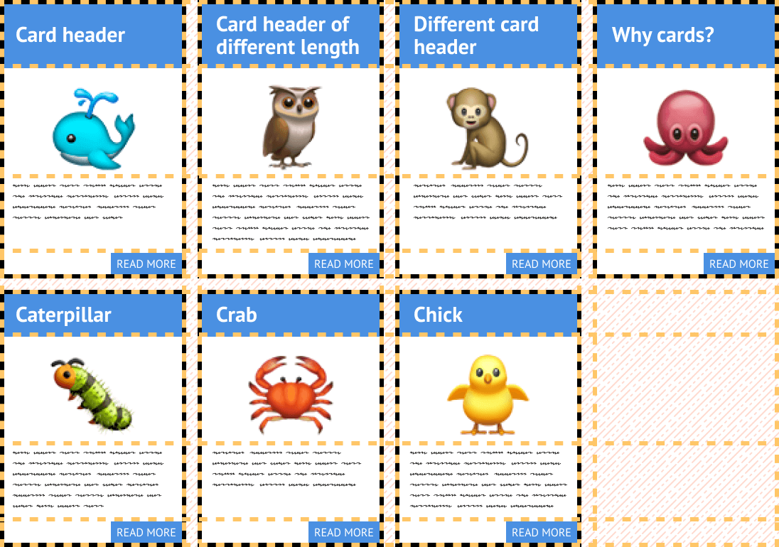
Basics of CSS Grid
Define your grid.
กำหนดแบบให้ grid

Place items in the grid.
วาง item ลงบน grid

Grid terminology

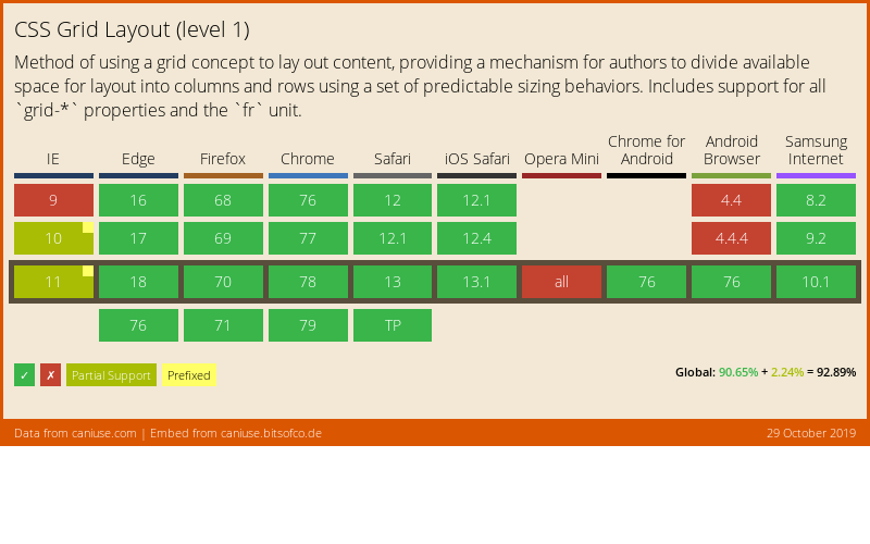
Browser support for Grid (Level 1)
Using DevTools to learn Grid
Live demo
What's in Grid Level 2?
-
Level 2 expands Grid by:
- adding “subgrid” capabilities for nested grids to participate in the sizing of their parent grids
- aspect-ratio–controlled gutters
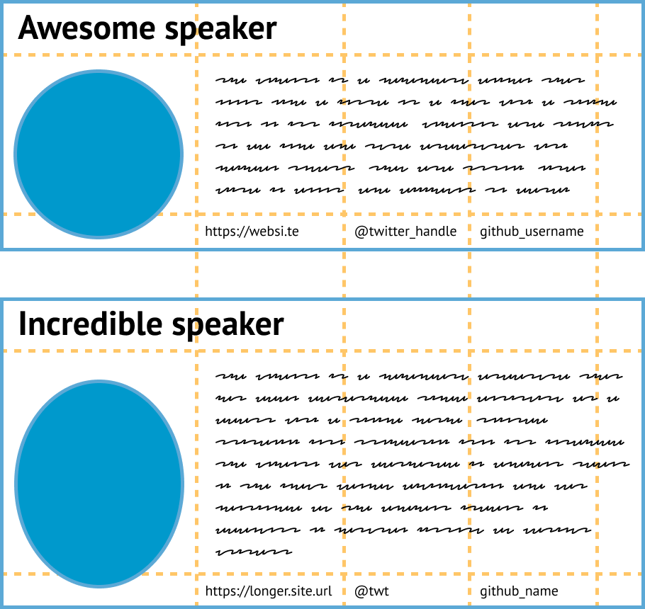
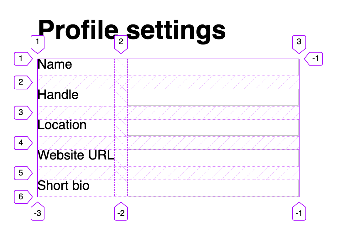
Why do we need subgrid?
The subgrid syntax
Same properties, more values
grid-template-columns: subgrid <line-name-list>?
grid-template-rows: subgrid <line-name-list>?
The subgrid keyword indicates to the browser the nested grid will use the same sizing as its parent along the relevant axis.
.subgrid-container {
  grid-columns: 2 / 5; /* placement for the subgrid container itself */

  display: grid; /* you must still apply a display: grid to the subgrid */
  grid-template-columns: subgrid;
  grid-template-rows: subgrid;
}Using DevTools to learn Subgrid
Live demo
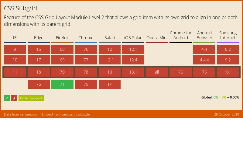
Browser support for subgrid
References
- CSS Flexible Box Layout Module Level 1
- CSS Grid Layout Module Level 1
- CSS Grid Layout Module Level 2
- Codrops reference: Subgrid
- Subgrid on MDN
- Grid Level 2 and Subgrid
- Why display: contents is not CSS Grid Layout subgrid
- CSS Grid Level 2: Here Comes Subgrid
- Grid by Example
- Researching a Property in the CSS Specifications
ขอบคุณค่ะ 🙇♀️


Header font is Ostrich Sans by Tyler Finck.
Body font is Libre Baskerville by Pablo Impallari.